SVGアニメーション – Web Animations API を使う – KeyFrameEffectについて

Posted コメントするカテゴリー: javascript

SVGアニメーション – Web Animations API を使う – KeyFrameEffectについて

KeyFrameEffectを試します。

基本構文

new KeyframeEffect(target, keyframes)
new KeyframeEffect(target, keyframes, options)
new KeyframeEffect(sourceKeyFrames)

サンプル

<!DOCTYPE html>
<html>
<head>
<meta charset="UTF-8">
<title>テストHTML</title>

<style>
.animate_timeline_dom {
    background-color: #cccccc;
    width: 150px;
}
</style>

</head>
<body>

<input type="button" id="button_1" value="animate timline test">
<div class="animate_timeline_dom">Test DOM</div>

<script>

button_1.addEventListener('click', () => {

	// DOM要素を取得
	let animate_timeline_dom = document.querySelector(".animate_timeline_dom");

	let keyframes_test = new KeyframeEffect(
		animate_timeline_dom,
		[
			{transform: "translateX(0px)"  },
			{transform: "translateX(200px)"},
			{transform: "translateY(100px)"},
			{transform: "scale(2)"         },
		],
		{ duration: 5000 },
	);
	
	let anim_test = new Animation(
		keyframes_test,
		document.timeline,
	);

    // アニメーションの再生
    anim_test.play();

}, false);
</script>
 
</body>
</html>
サーバ上のHTMLはこちら(test1.html)

サンプルでは、以下の箇所がKeyframeEffectを使用した定義です。

	let keyframes_test = new KeyframeEffect(
		animate_timeline_dom,
		[
			{transform: "translateX(0px)"  },
			{transform: "translateX(200px)"},
			{transform: "translateY(100px)"},
			{transform: "scale(2)"         },
		],
		{ duration: 5000 },
	);

targetは対象のDOM
keyframesは任意のアニメーションの内容を指定
optionsは任意のタイミングプロパティの内容を指定

前回の投稿で、animation の基本構文を書きました。

var animation = new Animation([effect][, timeline]);

この「effect」については、次の定義になります。

(MDNから抜粋)
このアニメーションに関連付けられた AnimationEffect を取得または設定します。
これはふつう、 KeyframeEffect オブジェクトになります。

上記のサンプルで、アニメーションの定義を次のようにしていますが、

	let anim_test = new Animation(
		keyframes_test,
		document.timeline,
	);

「keyframes_test」という記述が「new KeyframeEffect」したものであり、それが「new Animation([effect][, timeline]);」のeffectとして割り当てていると言えます。

new Animation の引数に new KeyframeEffect を記述する

new Animationの引数に直接new keyframeEffectを記述する例です。

<!DOCTYPE html>
<html>
<head>
<meta charset="UTF-8">
<title>テストHTML</title>

<style>
.animate_timeline_dom {
    background-color: #cccccc;
    width: 150px;
}
</style>

</head>
<body>

<input type="button" id="button_1" value="animate timline test">
<div class="animate_timeline_dom">Test DOM</div>

<script>

button_1.addEventListener('click', () => {

	let animate_timeline_dom = document.querySelector(".animate_timeline_dom");

	let anim_test = new Animation(
		new KeyframeEffect(
			animate_timeline_dom,
			[
				{transform: "translateX(0px)"  },
				{transform: "translateX(200px)"},
				{transform: "translateY(100px)"},
				{transform: "scale(2)"         },
			],
			{ duration: 5000 },
		),
		document.timeline,
	);

    // アニメーションの再生
    anim_test.play();

}, false);
</script>
 
</body>
</html>
サーバ上のHTMLはこちら(test2.html)

SVGアニメーション – Web Animations API を使う – timelineについて

Posted コメントするカテゴリー: javascript

SVGアニメーション – Web Animations API を使う – timelineについて

前回、animationの再生は、以下のように書きました。

var animation = new Animation([effect][, timeline]);

引数のtimelineについて試してみます。
前回のサンプルにtimelineの値を出力してみます。

<!DOCTYPE html>
<html>
<head>
<meta charset="UTF-8">
<title>テストHTML</title>

<style>
.animate_timeline_dom {
    background-color: #ebebeb;
}
</style>

</head>
<body>

<input type="button" id="button_1" value="animate timline test">
<div class="animate_timeline_dom">test</div>
<div id="log_disp"></div>

<script>
 
// animate timline testボタンの押下
let dom_button_1 = document.getElementById('button_1');

button_1.addEventListener('click', () => {

	// DOM要素を取得
	let animate_timeline_dom = document.querySelector(".animate_timeline_dom");

	// アニメーションのeffectとtimelineを定義
	animation = animate_timeline_dom.animate(
		[
			{ backgroundColor: '#fff', width:'100px'},
			{ backgroundColor: '#999', width:'50px' },
		],
		{
	    	duration: 8000
	    }
	);

	// timelineの値を出力して確認
	let log_disp_dom = document.getElementById('log_disp');

	const log_output = () => {
		let log_str = "";
		log_str += "animation.timeline.currentTime -> " + animation.timeline.currentTime.toFixed(2) + "<br />";
		log_str += "animation.startTime            -> " + animation.startTime.toFixed(2)            + "<br />";
		log_str += "animation.currentTime          -> " + animation.currentTime.toFixed(2)          + "<br />";
		log_disp_dom.innerHTML = log_str;
	}

	setInterval(log_output, 10);

    // アニメーションの再生
    animation.play();

}, false);
</script>
 
</body>
</html>
サーバ上のHTMLはこちら(test1.html)

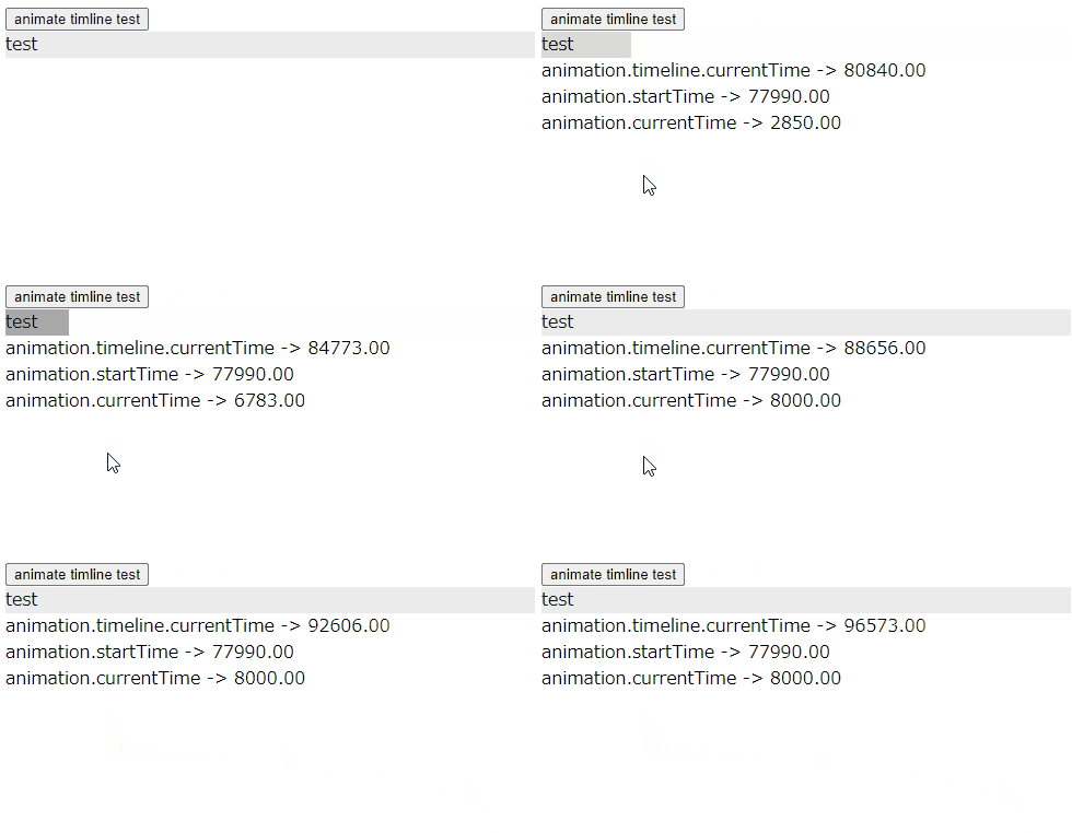
画面にアクセスしてanimate timeline test ボタンを押下すると
8秒かけて、domの長さと色が変化するアニメーションが始まります。

ここで注意したい点は

animation.timeline.currentTime
animation.startTime
animation.currentTime

で、それぞれどんな値(秒数)が取得できているかという点です。

currentTimeは画面が表示されてからの秒数がカウントされています。
animation.startTimeは、ボタンを押下してアニメーションが開始された秒数です。
animation.currentTimeは、アニメーションが再生されている秒数で、アニメーションが終了するとリセットされます。

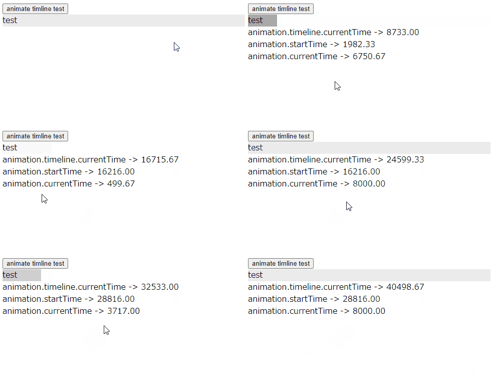
試しに8秒以上経過した後に、もう一度、animate timeline test ボタンを押下する(例では2回押下)とどうなるか、試してみます。

動きを見ると、animation.timeline.currentTime は画面が表示されてからリセットされずに秒数カウントがされてます。
animation.startTime はボタンを押したタイミングでのanimation.timeline.currentTimeの値を取得しています。
animation.currentTimeは上記の例と同様、アニメーションの再生中の秒数をカウントしており、再生が終わるとリセットされていることがわかります。

SVGアニメーション – Web Animations API を使う – 基本的な記述

Posted コメントするカテゴリー: javascript

SVGアニメーション – Web Animations API を使う – 基本的な記述

Animation()によるAnimationオブジェクトの生成を試します。

animationオブジェクトを生成する際の第二引数に用い、AnimationTimelineというインタフェースを取得している。

var animation = new Animation([effect][, timeline]);

これまで紹介してきた

Element.animate()

とは異なり、play()メソッドでアニメーションを開始する。

まずはこれまでの Element.animate() の書き方でサンプルを用意し、それをもとに、その後 animation = new Animation を試します。

<!DOCTYPE html>
<html>
<head>
<meta charset="UTF-8">
<title>テストHTML</title>

<style>
.animate_timeline_dom {
    background-color: #ebebeb;
}
</style>

</head>
<body>

<input type="button" id="button_1" value="animate test">
<div class="animate_dom">test</div>
<div id="log_disp"></div>

<script>

// アニメーション用の空オブジェクトを定義
let animation;

// 「animate test」ボタンのDOM取得と押下イベントの用意
let dom_button_1 = document.getElementById('button_1');
button_1.addEventListener('click', () => {

    // DOM要素を取得
    let animate_dom = document.querySelector(".animate_dom");

    // アニメーションの effect と timeline を定義
    animation = animate_dom.animate(
        [
            {backgroundColor: '#fff', width:'100px'},
            {backgroundColor: '#999', width:'50px' },
        ],
        {
            duration: 8000
        }
    );

    // アニメーションの再生
    animation.play();

}, false);
</script>
 
</body>
</html>

サーバ上のHTMLはこちら(test1.html)

いままでは Element.animate() という形でアニメーションを定義、再生していましたが、
Web Animation API のインターフェースとしてのAnimationを使用し、

animation.play();

というメソッドでアニメーション再生しています。

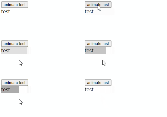
画面にアクセスして、animate testボタンを押下した時の動きは以下のようになります。

duration: 8000 の定義をしているので、8秒かけて
{backgroundColor: ‘#fff’, width:’100px’}
から
{backgroundColor: ‘#999′, width:’50px’ }
へアニメーションしていることがわかります。

SVGアニメーション – Web Animations API を使う – Animation

Posted コメントするカテゴリー: javascript

SVGアニメーション – Web Animations API を使う – Animation

ここからは Animation のAPI(インターフェイス) を使用した方法を試します。

Animation のAPIのプロパティとメソッド

プロパティ

Animation.currentTime
Animation.effect
Animation.finished
Animation.id
Animation.pending
Animation.playState
Animation.playbackRate
Animation.ready
animation.replaceState
Animation.startTime
Animation.timeline

メソッド

Animation.cancel()
Animation.finish()
Animation.pause()
Animation.play()
Animation.reverse()

(MDNから抜粋)

Animation()によるAnimationオブジェクトの生成

animationオブジェクトを生成するには以下のように書きます。

var animation = new Animation([effect][, timeline]);

引数はそれぞれ以下の指定をします。

effect
アニメーションに割り当てるエフェクト効果を指定。
現時点ではKeyFrameEffectオブジェクトのみ。

timeline
アニメーションに関連づけるtimelineを指定
現時点ではDocumentTimelineオブジェクトのみ。

SVGアニメーション – Web Animations API を使う – Element.animate()メソッドの options – 同一DOM要素に多重付与したanimate()をcomposite合成する

Posted コメントするカテゴリー: javascript

SVGアニメーション – Web Animations API を使う – Element.animate()メソッドの options – 同一DOM要素に多重付与したanimate()をcomposite合成する

同一DOM要素に多重に付与した animate()を合成するには、compositeプロパティを使用します。

このプロパティには下記の3つのうち、いずれかを指定します。

replace
add
accumulate

composite プロパティに「replace」を指定する場合

replace を指定した場合
transform の値は keyframes2 のtransformの値に置き換わって制御されます。
width と backgroundColor はそのまま keyframes1 の値が制御されます
(keyframes2と別項目なので置き換わりません)

<!DOCTYPE html>
<html>
<head>
<meta charset="UTF-8">
<title>テストHTML</title>

<style>
.pseudoElementTest {
    color: #000000;
    font-size: 1.2rem;
    width: 100px;
}
</style>

</head>
<body>

<div class="pseudoElementTest">test</div>
<input type="button" id="button_test1" value="pseudoElementTest1">

<script>
// DOM要素を取得
let pseudoElementTest = document.querySelector(".pseudoElementTest");

// アニメーション用
let animation1;

// アニメーション1 keyframesの定義
const keyframes1 = [
    {transform: 'translateX(0px)'  , width:'100px', backgroundColor:'#FF6600'},
    {transform: 'translateX(100px)', width:'50px' , backgroundColor:'#669933'},
];

// アニメーション2 keyframesの定義
const keyframes2 = [
    {transform: 'translateY(0px)'  },
    {transform: 'translateY(100px)'},
];

// botton1
let dom_test1 = document.getElementById('button_test1');

// botton1押下
dom_test1.addEventListener('click', () => {

    if (animation1) {
        animation1.pause(); // アニメーション1を一時停止
    }

    const currentOptions1 = {
        duration      : 8000
    };

    const currentOptions2 = {
        duration      : 8000,
        composite     : 'replace'
    };

    // オプションを再設定する
    animation1 = pseudoElementTest.animate(keyframes1, currentOptions1);

    // オプションを再設定する
    animation1 = pseudoElementTest.animate(keyframes2, currentOptions2);

    // アニメーション1の再生と停止
    animation1.play();
}, false);

</script>

</body>
</html>
サーバ上のHTMLはこちら(test1.html)

composite プロパティに「add」を指定する場合

add を指定した場合
transform の値は keyframes1とkeyframes2 のtransformの値が加算されて制御されます。
width と backgroundColor はそのまま keyframes1 の値が制御されます
(keyframes2と別項目なので加算もされず、置き換わりもしません)

<!DOCTYPE html>
<html>
<head>
<meta charset="UTF-8">
<title>テストHTML</title>

<style>
.pseudoElementTest {
    color: #000000;
    font-size: 1.2rem;
    width: 100px;
}
</style>

</head>
<body>

<div class="pseudoElementTest">test</div>
<input type="button" id="button_test1" value="pseudoElementTest1">

<script>
// DOM要素を取得
let pseudoElementTest = document.querySelector(".pseudoElementTest");

// アニメーション用
let animation1;

// アニメーション1 keyframesの定義
const keyframes1 = [
    {transform: 'translateX(0px)'  , width:'100px', backgroundColor:'#FF6600'},
    {transform: 'translateX(100px)', width:'50px' , backgroundColor:'#669933'},
];

// アニメーション2 keyframesの定義
const keyframes2 = [
    {transform: 'translateY(0px)'  },
    {transform: 'translateY(100px)'},
];

// botton1
let dom_test1 = document.getElementById('button_test1');

// botton1押下
dom_test1.addEventListener('click', () => {

    if (animation1) {
        animation1.pause(); // アニメーション1を一時停止
    }

    const currentOptions1 = {
        duration      : 8000
    };

    const currentOptions2 = {
        duration      : 8000,
        composite     : 'add'
    };

    // オプションを再設定する
    animation1 = pseudoElementTest.animate(keyframes1, currentOptions1);

    // オプションを再設定する
    animation1 = pseudoElementTest.animate(keyframes2, currentOptions2);

    // アニメーション1の再生と停止
    animation1.play();
}, false);

</script>

</body>
</html>
サーバ上のHTMLはこちら(test2.html)

composite プロパティに「accumulate」を指定する場合

accumulate を指定した場合
transform の値は keyframes1とkeyframes2 のtransformの値が累積されて制御されます。
width と backgroundColor はそのまま keyframes1 の値が制御されます
(keyframes2と別項目なので累積もされず、置き換わりもしません)

<!DOCTYPE html>
<html>
<head>
<meta charset="UTF-8">
<title>テストHTML</title>

<style>
.pseudoElementTest {
    color: #000000;
    font-size: 1.2rem;
    width: 100px;
}
</style>

</head>
<body>

<div class="pseudoElementTest">test</div>
<input type="button" id="button_test1" value="pseudoElementTest1">

<script>
// DOM要素を取得
let pseudoElementTest = document.querySelector(".pseudoElementTest");

// アニメーション用
let animation1;

// アニメーション1 keyframesの定義
const keyframes1 = [
    {transform: 'translateX(0px)'  , width:'100px', backgroundColor:'#FF6600'},
    {transform: 'translateX(100px)', width:'50px' , backgroundColor:'#669933'},
];

// アニメーション2 keyframesの定義
const keyframes2 = [
    {transform: 'translateY(0px)'  },
    {transform: 'translateY(100px)'},
];

// botton1
let dom_test1 = document.getElementById('button_test1');

// botton1押下
dom_test1.addEventListener('click', () => {

    if (animation1) {
        animation1.pause(); // アニメーション1を一時停止
    }

    const currentOptions1 = {
        duration      : 8000
    };

    const currentOptions2 = {
        duration      : 8000,
        composite     : 'accumulate'
    };

    // オプションを再設定する
    animation1 = pseudoElementTest.animate(keyframes1, currentOptions1);

    // オプションを再設定する
    animation1 = pseudoElementTest.animate(keyframes2, currentOptions2);

    // アニメーション1の再生と停止
    animation1.play();
}, false);

</script>

</body>
</html>
サーバ上のHTMLはこちら(test3.html)

補足

keyframes1 では、
 transform
 width
 backgroundColor
の値を制御しており、

keyframes2 では、
 transform
の値を制御しています。

accumulateはこの例ではaddと同様の動きになりますが、keyframesの項目数が多くなり、制御する項目を設定する順番でアニメーションに作用する順が変わります。

SVGアニメーション – Web Animations API を使う – Element.animate()メソッドの options – 同一DOM要素に多重にanimate()を適用した場合

Posted コメントするカテゴリー: javascript

SVGアニメーション – Web Animations API を使う – Element.animate()メソッドの options – 同一DOM要素に多重にanimate()を適用した場合

同一DOM要素に多重にanimate()を適用した場合、原則「後着優先」で処理されます。

例えば、アニメーション要素が2つあり、

①アニメーション1が10秒かけて色変化する
②アニメーション2が2秒後から5秒かけて色変化する

という場合、

アニメーション開始と同時に①のアニメーションが開始→終了されます。

ただ、この①の処理中に②が同一DOM要素に対してアニメーションされた場合、①のアニメーション要素は打ち消され、②のアニメーションが優先されます。

また、②のアニメーションが短時間で終わる場合は、②のアニメーション終了後に①のアニメーションが引続き継続されます。

以下、簡単なサンプルを用意しました。

<!DOCTYPE html>
<html>
<head>
<meta charset="UTF-8">
<title>テストHTML</title>

<style>
.pseudoElementTest {
    color: #000000;
    font-size: 1.2rem;
}
</style>

</head>
<body>

<div class="pseudoElementTest">test</div>
<input type="button" id="button_test1" value="pseudoElementTest1">

<script>
// DOM要素を取得
let pseudoElementTest = document.querySelector(".pseudoElementTest");

// アニメーション用
let animation1;

// アニメーション1 keyframesの定義
const keyframes1 = [
    {width:'100px', height:'50px', backgroundColor:'#FF6600'}, // オレンジ
    {width:'50px' , height:'50px', backgroundColor:'#FFFF00'}, // イエロー
];

// アニメーション2 keyframesの定義
const keyframes2 = [
    {width:'100px', height:'50px', backgroundColor:'#0033FF'}, // ブルー
    {width:'550px', height:'50px', backgroundColor:'#CC33FF'}, // パープル
];

// botton1
let dom_test1 = document.getElementById('button_test1');


// botton1押下
dom_test1.addEventListener('click', () => {

    if (animation1) {
        animation1.pause(); // アニメーション1を一時停止
    }

    const currentOptions1 = {
        duration      : 10000
    };

    const currentOptions2 = {
        duration      : 5000,
        delay         : 2000,
    };

    // オプションを再設定する
    animation1 = pseudoElementTest.animate(keyframes1, currentOptions1);

    // オプションを再設定する
    animation1 = pseudoElementTest.animate(keyframes2, currentOptions2);

    // アニメーション1の再生と停止
    animation1.play();
}, false);

</script>

</body>
</html>
サーバ上のHTMLはこちら(test1.html)

画面アクセスしてボタンを押下すると、アニメーション①が開始されます。

このとき、

「オレンジ → イエロー」の背景色が10秒かけて変化しますが、

2秒後にアニメーション②が開始された際、

「ブルー → パープル」のアニメーション②が優先されて開始することがわかります。

このように options が無指定でデフォルト設定の場合「後着優先」の処理がされることがわかります。

この動きを時系列の表にすると、次のアニメーションと時間の流れになります。

SVGアニメーション – Web Animations API を使う – Element.animate()メソッドの options – pseudoElement

Posted コメントするカテゴリー: javascript

SVGアニメーション – Web Animations API を使う – Element.animate()メソッドの options – pseudoElement

pseudoElement はDOMに記述された疑似要素セレクターの文字列(::before、::after、::marker等)に、アニメーションを適用します。

<!DOCTYPE html>
<html>
<head>
<meta charset="UTF-8">
<title>テストHTML</title>

<style>
.pseudoElementTest {
    color: #000000;
    font-size: 1.2rem;
}
.pseudoElementTest::before {
    content: "test1234";
}
</style>

</head>
<body>

<div class="pseudoElementTest"></div>
<input type="button" id="button_test1" value="pseudoElementTest1">

<script>
// DOM要素を取得
let pseudoElementTest = document.querySelector(".pseudoElementTest");

// アニメーション用
let animation1;

// アニメーション1 keyframesの定義
const keyframes1 = [
    {color: '#333333', width: 200},
    {color: '#FF9900', width: 200},
    {color: '#FF5566', width: 200}
];

// botton1
let dom_test1 = document.getElementById('button_test1');


// botton1押下
dom_test1.addEventListener('click', () => {

    if (animation1) {
        animation1.pause(); // アニメーション1を一時停止
    }

    // アニメーションのオプションを取得
    const currentOptions = {
        duration      : 3000,
        pseudoElement : '::before',
        iterations    : Infinity
    };

    // オプションを再設定する
    animation1 = pseudoElementTest.animate(keyframes1, currentOptions);

    // アニメーション1の再生と停止
    animation1.play();
}, false);

</script>

</body>
</html>
サーバ上のHTMLはこちら(test1.html)

画面アクセスしてボタンを押下すると、cssの

.pseudoElementTest::before {
    content: "test1234";
}

に定義した要素(画面上ではtest1234と表示されます)の「::before」が指定されているcss要素に対してアニメーションされることがわかります。

この時、事前に定義されている「pseudoElementTest」のcss定義には影響を及ぼしていないことがわかります。

.pseudoElementTest {
    color: #000000;
    font-size: 1.2rem;
}

SVGアニメーション – Web Animations API を使う – Element.animate()メソッドの options – iterationStart

Posted コメントするカテゴリー: javascript

SVGアニメーション – Web Animations API を使う – Element.animate()メソッドの options – iterationStart

Element.animate()メソッド の options の iterationStart について試してみます。

iterationStart は、アニメーションの開始秒数を指定します。

<!DOCTYPE html>
<html>
<head>
<meta charset="UTF-8">
<title>テストHTML</title>

<style>
.params_box {
    font-size : 0.8em;
}
.range {
    width: 400px;
}
.code_view {
    font-size : 0.8em;
    padding   : 5px;
    margin    : 20px 0;
    color     : #ffffff;
    background-color: #000000;
}
.code_view_str {
    color: #ff0000;
}
.status_view {
    margin-bottom: 20px;
}

#start_animation {
	margin: 0px 0px 30px 0px;
}
#status_message1 {
	color      : #ff0000;
	font-weight: bold;
}
</style>

</head>
<body>

<div class="status_view">
    <div>ステータス1:<span id="status_message1"></span></div>
</div>

<div>
	<input type="button" id="start_animation" value="アニメーション開始">
</div>

<div>
    <div class="params_box">
        <span>iterationStart  : </span><span class="params" id="range1_value"></span>
        <div><input type="range" class="range" id="range1" value="0" max="1" step="0.1"></div>

    </div>
</div>

<div class="code_view">
const options = {<br />
&nbsp;&nbsp;&nbsp;&nbsp; duration       : <span class="code_view_str">5000</span><br />
&nbsp;&nbsp;&nbsp;&nbsp; iterationStart : <span class="code_view_str" id="code_view1"></span><br />
&nbsp;&nbsp;&nbsp;&nbsp; iterations     : <span class="code_view_str">Infinity</span><br />
};
</div>

<svg xmlns="http://www.w3.org/2000/svg"
    width   = "500"
    height  = "100"
    viewBox = "0 0 500 100"
>
    <rect
        id     = "recttest"
        x      = "0"
        y      = "0"
        width  = "100"
        height = "50"
    />
</svg>

<script>

// アニメーション対象のDOM要素を取得
let dom_rect = document.querySelector("#recttest");

// ステータス表記
let status_message1 = document.querySelector('#status_message1');

let animation1;

// アニメーション1 keyframesの定義
const keyframes1 = [
    {width:'100px', height:'50px', fill:'#FF6600'}, // オレンジ
    {width:'50px' , height:'50px', fill:'#FFFF00'}, // イエロー
    {width:'450px', height:'50px', fill:'#FF0000'}  // レッド
];

// スライダの要素を取得し、イベントを付与する
let dom_range1 = document.querySelector('#range1');

// 各スライダーごとのイベントに、共通の関数を割り当てて処理する
dom_range1.addEventListener('input', change_range_slider);


// スライダーを動かした時の処理
function change_range_slider()
{
    if (animation1) {
        animation1.pause(); // アニメーション1を一時停止
    }

    status_message1.innerHTML = '';

    // アニメーションのオプションを取得
    const currentOptions = {
        duration       : 5000,
        iterationStart : dom_range1.value,
        iterations     : Infinity
    };

    // オプションを再設定する
    animation1 = dom_rect.animate(keyframes1, currentOptions);

    // アニメーション1の再生と停止
    animation1.play();

    status_message1.innerHTML = 'アニメーション1 再生';

    // パラメータ値をHTML出力
    let range1_value_dom = document.querySelector('#range1_value');
    range1_value_dom.innerHTML = dom_range1.value;

    let code_view1_dom = document.querySelector('#code_view1');
    code_view1_dom.innerHTML = dom_range1.value;
}

// ボタン要素のDOMを取得
let dom_start_animation = document.getElementById('start_animation');

// イベントを付与
dom_start_animation.addEventListener('click',  StartAnimation, false);


// ボタン押下時の処理
function StartAnimation()
{
	console.log("ボタン押下時の処理 ");

    status_message1.innerHTML = '';

    // パラメータ値をHTML出力
    let range1_value_dom = document.querySelector('#range1_value');
    range1_value_dom.innerHTML = dom_range1.value;

    // アニメーションのオプションを取得
    const currentOptions = {
        duration       : 5000,
        iterationStart : dom_range1.value,
        iterations     : Infinity
    };

	// アニメーション1 生成
	animation1 = dom_rect.animate(keyframes1, currentOptions);

	// アニメーション1 再生
	animation1.play();
	status_message1.innerHTML = 'アニメーション1 再生';

    let code_view1_dom = document.querySelector('#code_view1');
    code_view1_dom.innerHTML = dom_range1.value;

}

</script>

</body>
</html>

サーバ上のHTMLはこちら(test1.html)

スライダーの iterationStart の値を指定し、アニメーション開始ボタンを押下すると、スライダの値(0.0~1.0)に応じた値で、アニメーションの開始タイミングが決定されます。

SVGアニメーション – Web Animations API を使う – Element.animate()メソッドの options – fill

Posted コメントするカテゴリー: javascript

SVGアニメーション – Web Animations API を使う – Element.animate()メソッドの options – fill

Element.animate()メソッド の options の fill について試してみます。

fill
forwards 再生後、キーを最後のフレームで保持
backwards 再生前、キーを最初のフレームに保持
both 両方を適用する
none どちらも適用しない

サンプルでは、アニメーションを2つ用意し、以下の状態変化をします。

アニメーション1 再生
↓
アニメーション1 再生終了
↓
アニメーション2 再生
↓
アニメーション3 再生終了

また、アニメーション1 は暖色系の色で変化します。

オレンジ
↓
イエロー
↓
レッド

アニメーション2 は寒色系の色で変化します。

ブルー
↓
パープル
↓
グリーン

今回の animate()メソッドの options の fill については、

アニメーション1 の options に指定し、割り当てる値 (forwards, backwards, both, none)により、
どのような動きになるのかを見ます。

<!DOCTYPE html>
<html>
<head>
<meta charset="UTF-8">
<title>テストHTML</title>

<style>
.params_box {
    font-size : 0.8em;
}
.range {
    width: 400px;
}
.code_view {
    font-size : 0.8em;
    padding   : 5px;
    margin    : 20px 0;
    color     : #ffffff;
    background-color: #000000;
}
.code_view_str {
    color: #ff0000;
}
.status_view {
    margin-bottom: 20px;
}

#start_animation {
	margin: 0px 0px 30px 0px;
}
#status_message1, #status_message2, #fill_value {
	color      : #ff0000;
	font-weight: bold;
}
</style>

</head>
<body>

<div class="status_view">
    <div>ステータス1:<span id="status_message1"></span></div>
    <div>ステータス2:<span id="status_message2"></span></div>
</div>

<div>
    <input type="radio" name="fill_value" value="forwards" checked>forwards  (再生後、キーを最後のフレームで保持)<br />
    <input type="radio" name="fill_value" value="backwards">backwards        (再生前、キーを最初のフレームに保持)<br />
    <input type="radio" name="fill_value" value="both">both                  (両方を適用する)<br />
    <input type="radio" name="fill_value" value="none">none                  (どちらも適用しない)<br />
</div>

<div>
	<input type="button" id="start_animation" value="アニメーション開始">
</div>

<div>
    <div class="params_box">
        <span>duration (処理全体の秒数) : </span><span class="params" id="range1_value"></span>
        <div><input type="range" class="range" id="range1" value="5000" max="10000"></div>

        <span>endDelay (終了後の待機秒数) : </span><span class="params" id="range2_value"></span>
        <div><input type="range" class="range" id="range2" value="5000" max="10000"></div>
    </div>
</div>

<div class="code_view">
// アニメーション処理を実行 (animation1、animation2 共通で設定される)<br />
const options = {<br />
&nbsp;&nbsp;&nbsp;&nbsp; duration : <span id="code_view1" class="code_view_str">5000</span><br />
&nbsp;&nbsp;&nbsp;&nbsp; endDelay : <span id="code_view2" class="code_view_str">5000</span><br />
&nbsp;&nbsp;&nbsp;&nbsp; delay    : <span id="code_view2" class="code_view_str">3000</span><br />
&nbsp;&nbsp;&nbsp;&nbsp; fill     : <span id="code_view3" class="code_view_str"></span><br />
};<br /><br />
dom_rect.animate(keyframes, options);<br />
</div>

<svg xmlns="http://www.w3.org/2000/svg"
    width   = "500"
    height  = "100"
    viewBox = "0 0 500 100"
>
    <rect
        id     = "recttest"
        x      = "0"
        y      = "0"
        width  = "100"
        height = "50"
    />
</svg>

<script>

// アニメーション対象のDOM要素を取得
let dom_rect = document.querySelector("#recttest");

// ステータス表記
let status_message1 = document.querySelector('#status_message1');
let status_message2 = document.querySelector('#status_message2');

let animation1;
let animation2;

// アニメーション1 keyframesの定義
const keyframes1 = [
    {width:'100px', height:'50px', fill:'#FF6600'}, // オレンジ
    {width:'50px' , height:'50px', fill:'#FFFF00'}, // イエロー
    {width:'450px', height:'50px', fill:'#FF0000'}  // レッド
];

// アニメーション2 keyframesの定義
const keyframes2 = [
    {width:'100px', height:'50px', fill:'#0033FF'}, // ブルー
    {width:'550px', height:'50px', fill:'#CC33FF'}, // パープル
    {width:'300px', height:'50px', fill:'#339900'}  // グリーン
];

// スライダの要素を取得し、イベントを付与する
let dom_range1 = document.querySelector('#range1');
let dom_range2 = document.querySelector('#range2');

// 各スライダーごとのイベントに、共通の関数を割り当てて処理する
dom_range1.addEventListener('input', change_range_slider);
dom_range2.addEventListener('input', change_range_slider);


// スライダーを動かした時の処理
function change_range_slider()
{

    if (animation1) {
        animation1.pause(); // アニメーション1を一時停止
    }
    if (animation2) {
        animation2.pause(); // アニメーション2を一時停止
    }

    status_message1.innerHTML = '';
    status_message2.innerHTML = '';

	// 初期のアニメーション処理を実行
	const fill_value = document.querySelector('input[name="fill_value"]:checked').value;

    // アニメーションのオプションを取得
    const currentOptions = {
        duration : parseInt(dom_range1.value),
        endDelay : parseInt(dom_range2.value),
        delay    : 3000,
        fill     : fill_value
    };

    // オプションを再設定する
    animation1 = dom_rect.animate(keyframes1, currentOptions);

    // アニメーション1の再生と停止
    animation1.play();

    status_message1.innerHTML = 'アニメーション1 再生';

	// アニメーション1 再生終了時
    animation1.finished.then(() => {

    	console.log("アニメーション1 再生終了");
        status_message1.innerHTML = 'アニメーション1 再生終了';

        // アニメーション2 生成
        animation2 = dom_rect.animate(keyframes2, currentOptions);
        
        // アニメーション2 再生
        animation2.play();
        status_message2.innerHTML = 'アニメーション2 再生';
        
        // アニメーション2 再生終了時
        animation2.finished.then(() => {
        
            // アニメーション2 再生終了ログ
            console.log("アニメーション2 再生終了");
            status_message2.innerHTML = 'アニメーション2 再生終了';
        });

    });

    // パラメータ値をHTML出力
    let range1_value_dom = document.querySelector('#range1_value');
    let range2_value_dom = document.querySelector('#range2_value');
    range1_value_dom.innerHTML = dom_range1.value + "ミリ秒";
    range2_value_dom.innerHTML = dom_range2.value + "ミリ秒";

    let code_view1_dom = document.querySelector('#code_view1');
    let code_view2_dom = document.querySelector('#code_view2');
    let code_view3_dom = document.querySelector('#code_view3');
    code_view1_dom.innerHTML = dom_range1.value;
    code_view2_dom.innerHTML = dom_range2.value;
    code_view3_dom.innerHTML = fill_value;

}

// ボタン要素のDOMを取得
let dom_start_animation = document.getElementById('start_animation');

// イベントを付与
dom_start_animation.addEventListener('click',  StartAnimation, false);


// ボタン押下時の処理
function StartAnimation()
{
	console.log("ボタン押下時の処理 ");

    status_message1.innerHTML = '';
    status_message2.innerHTML = '';

	// 初期のアニメーション処理を実行
	const fill_value = document.querySelector('input[name="fill_value"]:checked').value;

    // パラメータ値をHTML出力
    let range1_value_dom = document.querySelector('#range1_value');
    let range2_value_dom = document.querySelector('#range2_value');
    range1_value_dom.innerHTML = dom_range1.value + "ミリ秒";
    range2_value_dom.innerHTML = dom_range2.value + "ミリ秒";

    // アニメーションのオプションを取得
    const currentOptions = {
        duration : parseInt(dom_range1.value),
        endDelay : parseInt(dom_range2.value),
        delay    : 3000,
        fill     : fill_value
    };

	// アニメーション1 生成
	animation1 = dom_rect.animate(keyframes1, currentOptions);

	// アニメーション1 再生
	animation1.play();
	status_message1.innerHTML = 'アニメーション1 再生';

	// アニメーション1 再生終了時
	animation1.finished.then(() => {

	    // アニメーション1 再生終了ログ
	    console.log("アニメーション1 再生終了");
        status_message1.innerHTML = 'アニメーション1 再生終了';

        // アニメーション2 生成
        animation2 = dom_rect.animate(keyframes2, currentOptions);
        
        // アニメーション2 再生
        animation2.play();
        status_message2.innerHTML = 'アニメーション2 再生';
        
        // アニメーション2 再生終了時
        animation2.finished.then(() => {
        
            // アニメーション2 再生終了ログ
            console.log("アニメーション2 再生終了");
            status_message2.innerHTML = 'アニメーション2 再生終了';
        });

	});

    let code_view1_dom = document.querySelector('#code_view1');
    let code_view2_dom = document.querySelector('#code_view2');
    let code_view3_dom = document.querySelector('#code_view3');
    code_view1_dom.innerHTML = dom_range1.value;
    code_view2_dom.innerHTML = dom_range2.value;
    code_view3_dom.innerHTML = fill_value;

}

</script>

</body>
</html>

サーバ上のHTMLはこちら(test1.html)

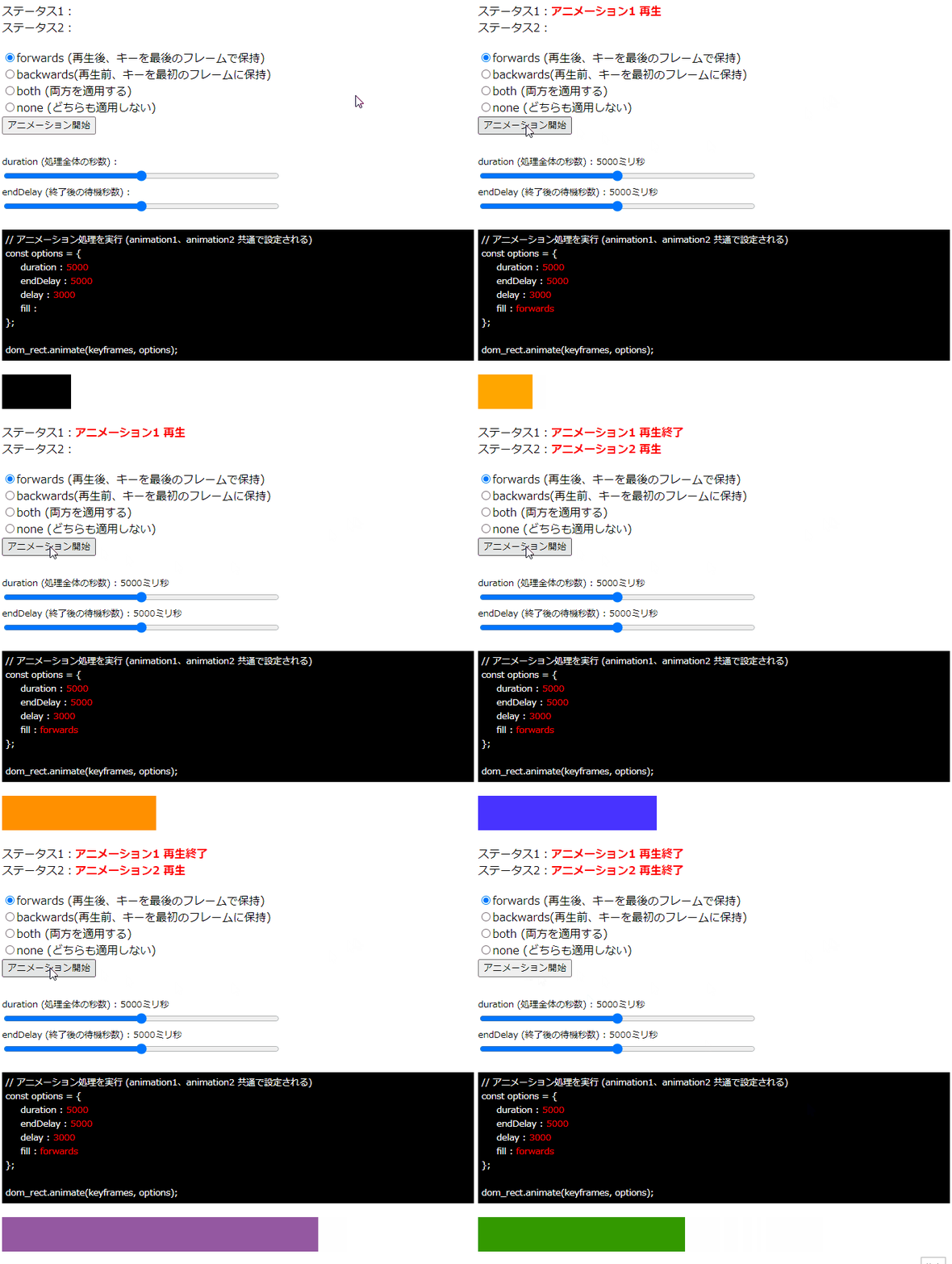
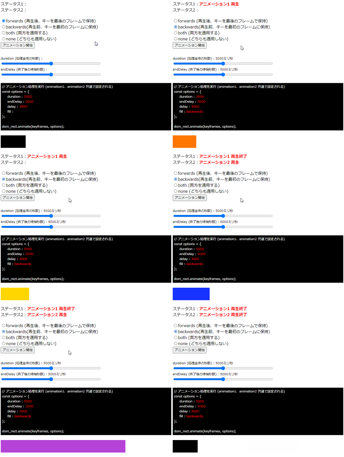
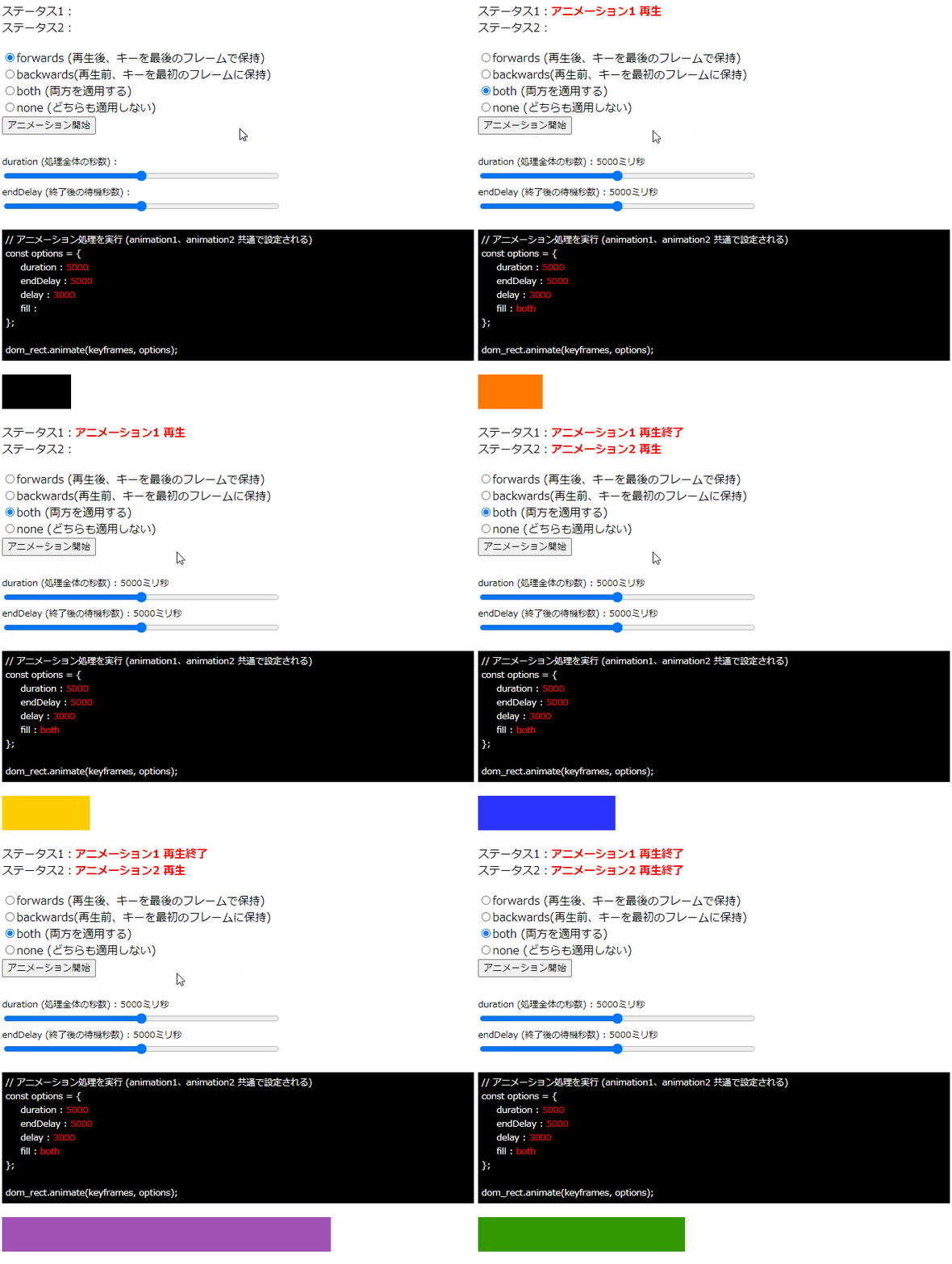
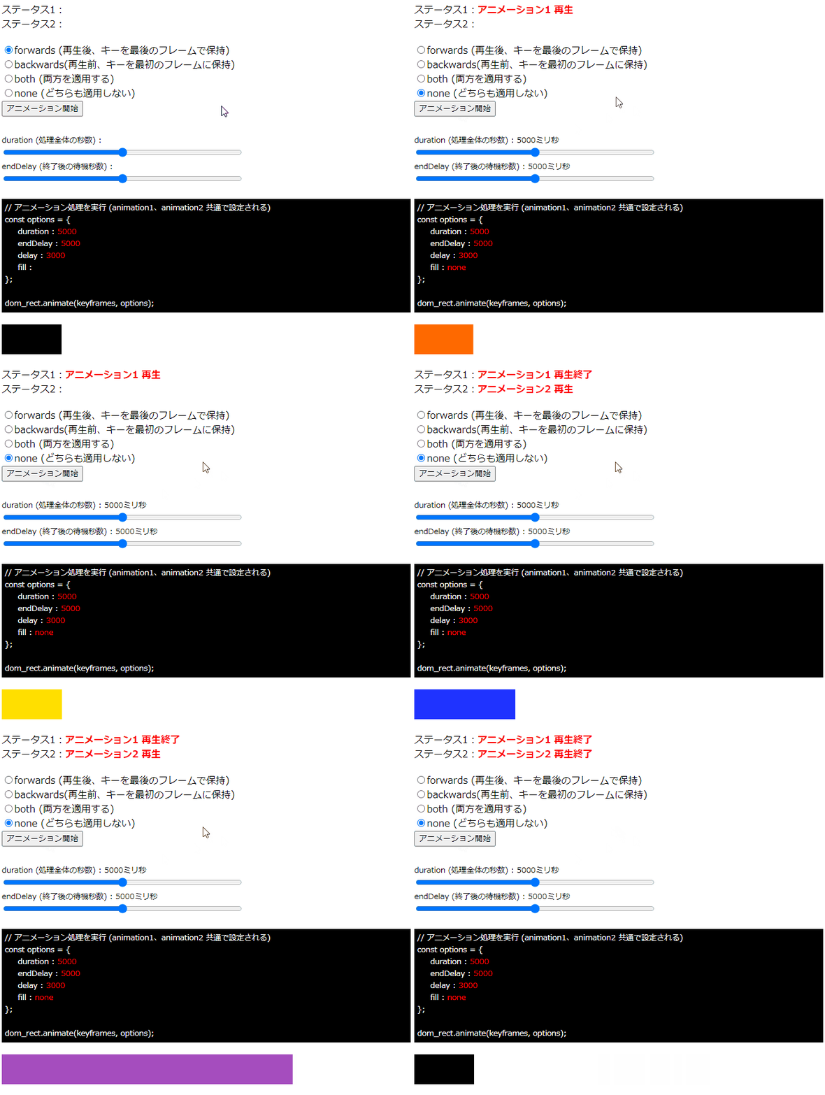
画面の「アニメーション開始」ボタンをすると、forwards、backwards、both、noneの選択により、
アニメーション1の開始前と終了後、アニメーション2の開始前と終了後の動作が変わることが確認できます。

実行例

forwardsを指定した場合

backwardsを指定した場合

bothを指定した場合

noneを指定した場合

注意が必要な点としては、上記の実行例4パターンの全てで「delay」を3000ミリ秒を指定している点です。

fillの指定は、delayの値の前後に影響する仕様なので、delayが無指定の場合や、
0の場合はfillによる状態変化がわからなくなる点に注意が必要です。

SVGアニメーション – Web Animations API を使う – Element.animate()メソッドの options – endDelay

Posted コメントするカテゴリー: javascript

SVGアニメーション – Web Animations API を使う – Element.animate()メソッドの options – endDelay

Element.animate()メソッド の options の endDelay について試してみます。

endDelayはアニメーション終了後の処理完了までの遅延時間として指定します。

アニメーションは 再生開始 → 再生中 → 再生終了 の一連の動きとみることができますが、
画面では見えないですが、再生終了の後に処理完了のタイミングがあります。

この処理完了は animate で生成したインスタンスに対し finished メソッドを記述することで
処理完了時のイベントを書くことができます。

また、endDelay の時間指定はミリ秒で指定し、再生終了から処理完了までの時間を制御することができます。

遅延時間を把握しやすいように、下記にサンプルコードを用意しました。

<!DOCTYPE html>
<html>
<head>
<meta charset="UTF-8">
<title>テストHTML</title>

<style>
.params_box {
    font-size : 0.8em;
}
.range {
    width: 400px;
}
.code_view {
    font-size : 0.8em;
    padding   : 5px;
    margin    : 20px 0;
    color     : #ffffff;
    background-color: #000000;
}
.code_view_str {
    color: #ff0000;
}
.status_view {
    margin-bottom: 20px;
}
</style>

</head>
<body>

<div class="status_view">
    <div>ステータス1:<span id="status_message1"></span></div>
    <div>ステータス2:<span id="status_message2"></span></div>
</div>

<div>
    <div class="params_box">
        <span>duration (処理全体の秒数) : </span><span class="params" id="range1_value"></span>
        <div><input type="range" class="range" id="range1" value="0" max="10000"></div>

        <span>endDelay (終了後の待機秒数) : </span><span class="params" id="range2_value"></span>
        <div><input type="range" class="range" id="range2" value="0" max="10000"></div>
    </div>
</div>

<div class="code_view">
// アニメーション処理を実行 (animation1、animation2 共通で設定される)<br />
const options = {<br />
&nbsp;&nbsp;&nbsp;&nbsp; duration: "<span id="code_view1" class="code_view_str">4000</span>"<br />
&nbsp;&nbsp;&nbsp;&nbsp; endDelay: "<span id="code_view2" class="code_view_str">4000</span>"<br />
};<br /><br />
dom_rect.animate(keyframes, options);<br />
</div>

<svg xmlns="http://www.w3.org/2000/svg"
    width   = "500"
    height  = "100"
    viewBox = "0 0 500 100"
>
    <rect
        id     = "recttest"
        x      = "0"
        y      = "0"
        width  = "100"
        height = "50"
        fill   = "#999"
    />
</svg>

<script>
// アニメーション対象のDOM要素を取得
let dom_rect = document.querySelector("#recttest");

// ステータス表記
let status_message1 = document.querySelector('#status_message1');
let status_message2 = document.querySelector('#status_message2');

let animation1;
let animation2;

// アニメーション1 keyframesの定義
const keyframes1 = [
    {width:'100px', height:'50px', fill:'#B0E0E6'}, // LightBlue
    {width:'50px' , height:'50px', fill:'#6495ED'}, // CornflowerBlue
    {width:'450px', height:'50px', fill:'#00008B'}  // DarkBlue
];
// アニメーション1 オプション定義
const options1 = {
    duration: 5000,
    endDelay: 4000
};

// アニメーション2 keyframesの定義
const keyframes2 = [
    {width:'100px', height:'50px', fill:'#F08080'}, // LightCoral
    {width:'550px', height:'50px', fill:'#FFA07A'}, // LightSalmon
    {width:'300px', height:'50px', fill:'#FF0000'}  // Red
];
// アニメーション2 オプション定義
const options2 = {
    duration: 5000,
    endDelay: 4000
};

// スライダの要素を取得し、イベントを付与する
let dom_range1 = document.querySelector('#range1');
let dom_range2 = document.querySelector('#range2');

// 各スライダーごとのイベントに、共通の関数を割り当てて処理する
dom_range1.addEventListener('input', change_range_slider);
dom_range2.addEventListener('input', change_range_slider);

// スライダーを動かした時の処理
function change_range_slider()
{

    if (animation1) {
        animation1.pause(); // アニメーション1を一時停止
    }
    if (animation2) {
        animation2.pause(); // アニメーション2を一時停止
    }

    status_message1.innerHTML = '';
    status_message2.innerHTML = '';

    // アニメーションのオプションを取得
    const currentOptions = {
        duration: parseInt(dom_range1.value),
        endDelay: parseInt(dom_range2.value)
    };

    // オプションを再設定する
    animation1 = dom_rect.animate(keyframes1, currentOptions);

    // アニメーションの再生と停止
    animation1.play();
    status_message1.innerHTML = 'アニメーション1 再生';

    animation1.finished.then(() => {
    	console.log("アニメーション1 再生終了");
        status_message1.innerHTML = 'アニメーション1 再生終了';

        // アニメーション2 生成
        animation2 = dom_rect.animate(keyframes2, options2);
        
        // アニメーション2 再生
        animation2.play();
        status_message2.innerHTML = 'アニメーション2 再生';
        
        // アニメーション2 再生終了時
        animation2.finished.then(() => {
        
            // アニメーション2 再生終了ログ
            console.log("アニメーション2 再生終了");
            status_message2.innerHTML = 'アニメーション2 再生終了';
        });

    });

    // パラメータ値をHTML出力
    let range1_value_dom = document.querySelector('#range1_value');
    let range2_value_dom = document.querySelector('#range2_value');
    range1_value_dom.innerHTML = (dom_range1.value / 1000) + "秒";
    range2_value_dom.innerHTML = (dom_range2.value / 1000) + "秒";

    let code_view1_dom = document.querySelector('#code_view1');
    let code_view2_dom = document.querySelector('#code_view2');
    code_view1_dom.innerHTML = dom_range1.value;
    code_view2_dom.innerHTML = dom_range2.value;

}


//--------------------------------------
// 初期処理
//--------------------------------------

// アニメーション1 生成
animation1 = dom_rect.animate(keyframes1, options1);

// アニメーション1 再生
animation1.play();
status_message1.innerHTML = 'アニメーション1 再生';

// アニメーション1 再生終了時
animation1.finished.then(() => {

    // アニメーション1 再生終了ログ
    console.log("アニメーション1 再生終了");
    status_message1.innerHTML = 'アニメーション1 再生終了';
    
    // アニメーション2 生成
    animation2 = dom_rect.animate(keyframes2, options2);

    // アニメーション2 再生
    animation2.play();
    status_message2.innerHTML = 'アニメーション2 再生';
    
    // アニメーション2 再生終了時
    animation2.finished.then(() => {
    
        // アニメーション2 再生終了ログ
        console.log("アニメーション2 再生終了");
        status_message2.innerHTML = 'アニメーション2 再生終了';
    });

});


</script>

</body>
</html>
サーバ上のHTMLはこちら(test1.html)

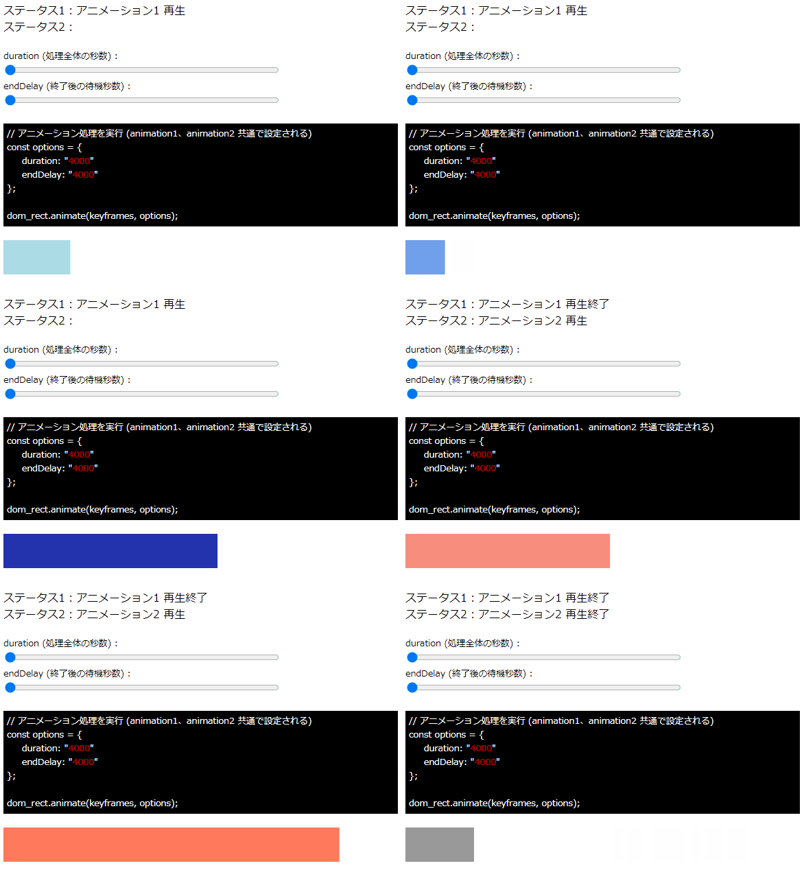
画面にはアニメーションの定義が2つ用意しており、わかりやすいようにrect(矩形)の色が変化と幅が変化します。

アニメーション1 (寒色系の色で変化)
LightBlue
↓
CornflowerBlue
↓
DarkBlue

アニメーション2 (暖色系の色で変化)
LightCoral
↓
LightSalmon
↓
Red

また、endDelay の値をスライダーで動的に指定することができます。

動きとしては、
アニメーション1 の「再生 → 再生中 → 再生終了」後に、アニメーション2の「再生 → 再生中 → 再生終了」
という動作をしますが、

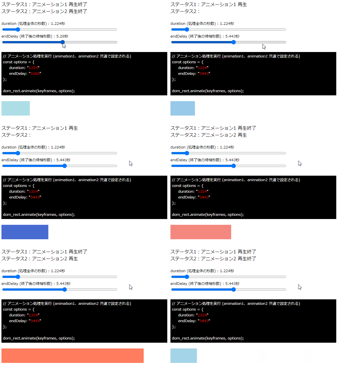
スライダーで値を調整すると、アニメーション1 の終了後に、処理終了までの遅延時間が調整され、アニメーション2 の再生開始のタイミングに影響していることがわかります。

実行例

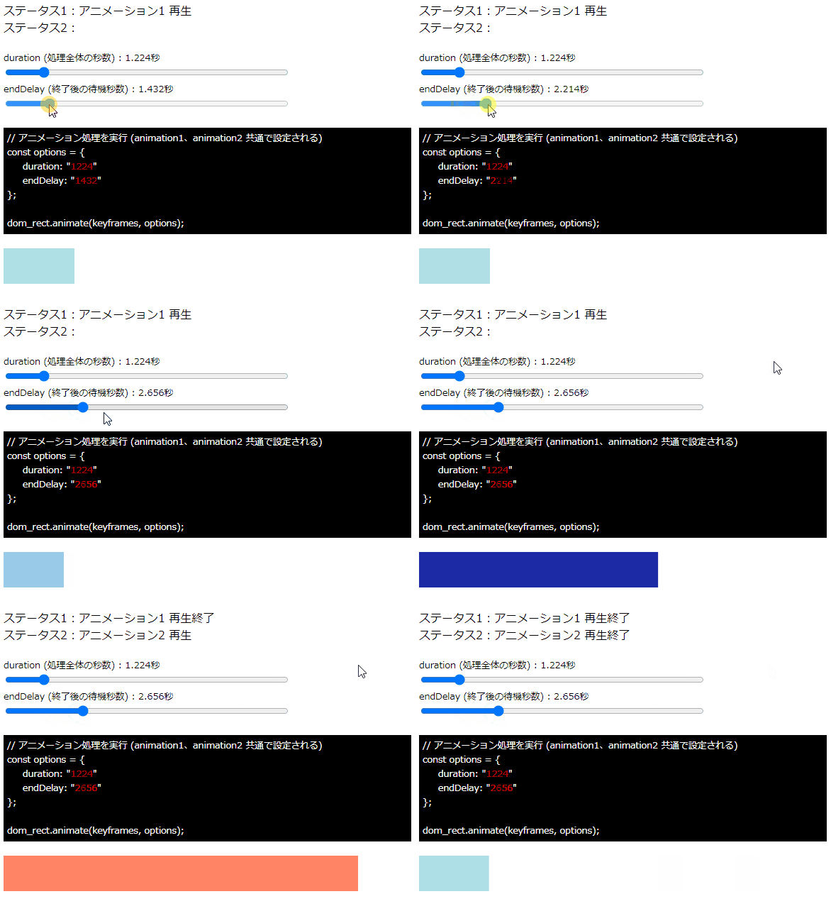
スライダーの値をデフォルト、endDelayが短い場合、長めの場合、でそれぞれ実行例を示します。

実行例1.スライダーはデフォルト(4.0秒)の状態で実行

実行例2.処理全体の秒数を1.224秒、endDelayの待機秒数を2.656秒に設定した場合

実行例3.処理全体の秒数を1.224秒、endDelayの待機秒数を5.443秒に設定した場合

それぞれのパターンの例をみると、endDelayの指定秒数により、アニメーション1が終わり、アニメーション2が始まるまでに遅延時間が変化することがわかります。

SVGアニメーション – Web Animations API を使う – Element.animate()メソッドの options – easing の cubic-bezier

Posted コメントするカテゴリー: javascript

SVGアニメーション – Web Animations API を使う – Element.animate()メソッドの options – easing の cubic-bezier

Element.animate()メソッド の options の easing の cubic-bezier について試してみます。

cubic-bezierはメソッドとして指定し、cubic-bezier()の引数を指定して、
3次ベジェ曲線を定義し、その3次ベジェ曲線の変化量をアニメーションに反映させてアニメーション変化をします。

引数は4つあり、下記の値を指定します。

第1制御点の x座標
第1制御点の y座標
第2制御点の x座標
第2制御点の y座標

値はnumber型として指定します。

イージング関数の変化量は下記サイトで代表的なものが確認できます。
https://easings.net/ja

以下、前回のサンプルをもとに、変化量をcubic-bezierで指定したサンプルです。

<!DOCTYPE html>
<html>
<head>
<meta charset="UTF-8">
<title>テストHTML</title>

<style>
#start_animation {
    margin-bottom: 10px;
}
</style>

</head>
<body>

<div>
    <input type="button" id="start_animation" value="アニメーション開始">
</div>

<svg xmlns="http://www.w3.org/2000/svg"
    width   = "500"
    height  = "100"
    viewBox = "0 0 500 100"
>
    <rect
        id     = "recttest"
        x      = "0"
        y      = "0"
        width  = "100"
        height = "70"
        fill   = "#999"
    />
</svg>

<script>

// ボタン要素のDOMを取得
let dom_start_animation = document.getElementById('start_animation');

// イベントを付与
dom_start_animation.addEventListener('click',  StartAnimation, false);

// ボタン押下時の処理
function StartAnimation()
{
    // アニメーション対象のDOM要素を取得
    let dom_recttest = document.querySelector("#recttest");

    // keyframesの定義
    const keyframes = [
        {x:'0px'  , fill:'#999999', easing: 'cubic-bezier(0.23, 1, 0.32, 1)'}, // グレー
        {x:'100px', fill:'#3399FF', easing: 'cubic-bezier(0.23, 1, 0.32, 1)'}, // ブルー
        {x:'400px', fill:'#FF9900', easing: 'cubic-bezier(0.23, 1, 0.32, 1)'}, // オレンジ
    ];

    // アニメーション処理のタイミングプロパティを定義
    const options = {
        duration: 5000
    };

    dom_recttest.animate(keyframes, options);
}

</script>

</body>
</html>

サーバ上のHTMLはこちら(test1.html)

SVGアニメーション – Web Animations API を使う – Element.animate()メソッドの options – easing の steps(count, start|end) について(その2) 引数をつけた場合

Posted コメントするカテゴリー: javascript

SVGアニメーション – Web Animations API を使う – Element.animate()メソッドの options – easing の steps(count, start|end) について(その2) 引数をつけた場合

前回の投稿に続き、Element.animate()メソッド の options の easing について試してみます。

easingプロパティ – steps(count, start|end) について

steps は「ステップごとに等分に区切って変化」をします。

前回の投稿では、下記のkeyframesの設定を試しました。

// keyframesの定義
const keyframes = [
    {x:'0px'  , fill:'#999999', easing: 'steps(5)'}, // グレー
    {x:'100px', fill:'#3399FF', easing: 'steps(5)'}, // ブルー
    {x:'400px', fill:'#FF9900', easing: 'steps(5)'}, // オレンジ
];

上記の場合「steps(5)」という設定をしているので、アニメーションの実行タイミング(区切り)は5段階で動作しました。

今回は、前回のサンプルをもとに、

steps(1, start)

のサンプルを試してみます。

引数の一つ目は「1」としていますが、これは「開始状態から終了状態まで1段階で切り替える」設定となります。

また、以下の書き方は

steps(1, start)

下記の書き方と同じ意味で動作します。

step-start

steps(1, start)について

まずは「steps(1, start)」と書いた場合です。

<!DOCTYPE html>
<html>
<head>
<meta charset="UTF-8">
<title>テストHTML</title>

<style>
#start_animation {
    margin-bottom: 10px;
}
</style>

</head>
<body>

<div>
    <input type="button" id="start_animation" value="アニメーション開始">
</div>

<svg xmlns="http://www.w3.org/2000/svg"
    width   = "500"
    height  = "100"
    viewBox = "0 0 500 100"
>
    <rect
        id     = "recttest"
        x      = "0"
        y      = "0"
        width  = "100"
        height = "70"
        fill   = "#999"
    />
</svg>

<script>

// ボタン要素のDOMを取得
let dom_start_animation = document.getElementById('start_animation');

// イベントを付与
dom_start_animation.addEventListener('click',  StartAnimation, false);

// ボタン押下時の処理
function StartAnimation()
{
    // アニメーション対象のDOM要素を取得
    let dom_recttest = document.querySelector("#recttest");

    // keyframesの定義
    const keyframes = [
        {x:'0px'  , fill:'#999999', easing: 'steps(1, start)'}, // グレー
        {x:'100px', fill:'#3399FF', easing: 'steps(1, start)'}, // ブルー
        {x:'400px', fill:'#FF9900', easing: 'steps(1, start)'}, // オレンジ
    ];

    // アニメーション処理のタイミングプロパティを定義
    const options = {
        duration: 5000
    };

    dom_recttest.animate(keyframes, options);
}

</script>

</body>
</html>

サーバ上のHTMLはこちら(test1.html)

画面にアクセスして「アニメーション開始」ボタンを押下すると、
「グレー → ブルー」まで1段階で(開始状態から終了状態に動作する)変化し、
その後に「ブルー → オレンジ」まで1段階で(開始状態から終了状態に動作する)変化することがわかります。

step-start について

上記のサンプルを下記のように変更して試してみます。

<!DOCTYPE html>
<html>
<head>
<meta charset="UTF-8">
<title>テストHTML</title>

<style>
#start_animation {
    margin-bottom: 10px;
}
</style>

</head>
<body>

<div>
    <input type="button" id="start_animation" value="アニメーション開始">
</div>

<svg xmlns="http://www.w3.org/2000/svg"
    width   = "500"
    height  = "100"
    viewBox = "0 0 500 100"
>
    <rect
        id     = "recttest"
        x      = "0"
        y      = "0"
        width  = "100"
        height = "70"
        fill   = "#999"
    />
</svg>

<script>

// ボタン要素のDOMを取得
let dom_start_animation = document.getElementById('start_animation');

// イベントを付与
dom_start_animation.addEventListener('click',  StartAnimation, false);

// ボタン押下時の処理
function StartAnimation()
{
    // アニメーション対象のDOM要素を取得
    let dom_recttest = document.querySelector("#recttest");

    // keyframesの定義
    const keyframes = [
        {x:'0px'  , fill:'#999999', easing: 'step-start'}, // グレー
        {x:'100px', fill:'#3399FF', easing: 'step-start'}, // ブルー
        {x:'400px', fill:'#FF9900', easing: 'step-start'}, // オレンジ
    ];

    // アニメーション処理のタイミングプロパティを定義
    const options = {
        duration: 5000
    };

    dom_recttest.animate(keyframes, options);
}

</script>

</body>
</html>

サーバ上のHTMLはこちら(test2.html)

画面にアクセスし「アニメーション開始」ボタンを押下すると、
上記のサンプルと同様の変化をすることがわかります。

steps(1, end) について

上記のサンプルを下記のように変更して試してみます。

<!DOCTYPE html>
<html>
<head>
<meta charset="UTF-8">
<title>テストHTML</title>

<style>
#start_animation {
    margin-bottom: 10px;
}
</style>

</head>
<body>

<div>
    <input type="button" id="start_animation" value="アニメーション開始">
</div>

<svg xmlns="http://www.w3.org/2000/svg"
    width   = "500"
    height  = "100"
    viewBox = "0 0 500 100"
>
    <rect
        id     = "recttest"
        x      = "0"
        y      = "0"
        width  = "100"
        height = "70"
        fill   = "#999"
    />
</svg>

<script>

// ボタン要素のDOMを取得
let dom_start_animation = document.getElementById('start_animation');

// イベントを付与
dom_start_animation.addEventListener('click',  StartAnimation, false);

// ボタン押下時の処理
function StartAnimation()
{
    // アニメーション対象のDOM要素を取得
    let dom_recttest = document.querySelector("#recttest");

    // keyframesの定義
    const keyframes = [
        {x:'0px'  , fill:'#999999', easing: 'steps(1, end)'}, // グレー
        {x:'100px', fill:'#3399FF', easing: 'steps(1, end)'}, // ブルー
        {x:'400px', fill:'#FF9900', easing: 'steps(1, end)'}, // オレンジ
    ];

    // アニメーション処理のタイミングプロパティを定義
    const options = {
        duration: 5000
    };

    dom_recttest.animate(keyframes, options);
}

</script>

</body>
</html>

サーバ上のHTMLはこちら(test3.html)

画面にアクセスして「アニメーション開始」ボタンを押下すると、
「グレー → ブルー」まで1段階で変化します。

ただし、steps(1, start) との違いは、アニメーションの変化として「終了になったら終了状態に変化する」という点が異なります。

その為、開始ボタンを押下した直後は、変化が何もないように見えます。

また、2つめから3つめののkeyframesの要素に変化する時は「ブルー → オレンジ」の変化をしますが、
「終了になったら終了状態に変化する」という性質上、最後のオレンジは画面からは確認できません。

これはアニメーションの終わりがoptionsの「iterations」を指定しておらず、
繰り返しアニメーションしない設定になっている為、アニメーション全体が終了して初期状態に戻る為です。

step-end について

上記のサンプルを下記のように変更して試してみます。

<!DOCTYPE html>
<html>
<head>
<meta charset="UTF-8">
<title>テストHTML</title>

<style>
#start_animation {
    margin-bottom: 10px;
}
</style>

</head>
<body>

<div>
    <input type="button" id="start_animation" value="アニメーション開始">
</div>

<svg xmlns="http://www.w3.org/2000/svg"
    width   = "500"
    height  = "100"
    viewBox = "0 0 500 100"
>
    <rect
        id     = "recttest"
        x      = "0"
        y      = "0"
        width  = "100"
        height = "70"
        fill   = "#999"
    />
</svg>

<script>

// ボタン要素のDOMを取得
let dom_start_animation = document.getElementById('start_animation');

// イベントを付与
dom_start_animation.addEventListener('click',  StartAnimation, false);

// ボタン押下時の処理
function StartAnimation()
{
    // アニメーション対象のDOM要素を取得
    let dom_recttest = document.querySelector("#recttest");

    // keyframesの定義
    const keyframes = [
        {x:'0px'  , fill:'#999999', easing: 'step-end'}, // グレー
        {x:'100px', fill:'#3399FF', easing: 'step-end'}, // ブルー
        {x:'400px', fill:'#FF9900', easing: 'step-end'}, // オレンジ
    ];

    // アニメーション処理のタイミングプロパティを定義
    const options = {
        duration: 5000
    };

    dom_recttest.animate(keyframes, options);
}

</script>

</body>
</html>

サーバ上のHTMLはこちら(test4.html)

画面にアクセスし「アニメーション開始」ボタンを押下すると、
steps(1, end) の時と同じ変化をします。

SVGアニメーション – Web Animations API を使う – Element.animate()メソッドの options – easing の steps(count, start|end) について

Posted コメントするカテゴリー: javascript

SVGアニメーション – Web Animations API を使う – Element.animate()メソッドの options – easing の steps(count, start|end) について

前回の投稿に続き、Element.animate()メソッド の options の easing について試してみます。

easingプロパティ – steps(count, start|end) について

steps は「ステップごとに等分に区切って変化」をします。

例として

steps(数値)

という引数が一つのみ記載する場合と、

steps(数値, start)

または

steps(数値, end)

という二つ目の引数を書く場合があります。

まずは、前回の投稿サンプルを「steps(数値)」の形で書いて試してみます。

<!DOCTYPE html>
<html>
<head>
<meta charset="UTF-8">
<title>テストHTML</title>

<style>
#start_animation {
    margin-bottom: 10px;
}
</style>

</head>
<body>

<div>
	<input type="button" id="start_animation" value="アニメーション開始">
</div>

<svg xmlns="http://www.w3.org/2000/svg"
    width   = "500"
    height  = "100"
    viewBox = "0 0 500 100"
>
    <rect
        id     = "recttest"
        x      = "0"
        y      = "0"
        width  = "100"
        height = "70"
        fill   = "#999"
    />
</svg>

<script>

// ボタン要素のDOMを取得
let dom_start_animation = document.getElementById('start_animation');

// イベントを付与
dom_start_animation.addEventListener('click',  StartAnimation, false);

// ボタン押下時の処理
function StartAnimation()
{
	// アニメーション対象のDOM要素を取得
	let dom_recttest = document.querySelector("#recttest");

	// keyframesの定義
	const keyframes = [
	    {x:'0px'  , fill:'#999999', easing: 'steps(5)'}, // グレー
	    {x:'100px', fill:'#3399FF', easing: 'steps(5)'}, // ブルー
	    {x:'400px', fill:'#FF9900', easing: 'steps(5)'}, // オレンジ
	];

	// アニメーション処理のタイミングプロパティを定義
	const options = {
	    duration: 5000
	};

	dom_recttest.animate(keyframes, options);
}

</script>

</body>
</html>

サーバ上のHTMLはこちら(test1.html)

上記のサンプルでは、各keyframesに

steps(5)

という5という値を設定しています。

5に設定すると、アニメーションが5段階に別れた状態で変化します。

画面にアクセスすると、各keyframesで指定した開始の状態(グレー)、途中の状態(ブルー)、終了の状態(オレンジ)の各状態に対して、5段階のx軸移動と、色変化をすることがわかります。

SVGアニメーション – Web Animations API を使う – Element.animate()メソッドの options – easing の ease-in-out について

Posted コメントするカテゴリー: javascript

SVGアニメーション – Web Animations API を使う – Element.animate()メソッドの options – easing の ease-in-out について

前回の投稿に続き、Element.animate()メソッド の options の easing について試してみます。

easingプロパティ – ease-in-out について

ease-in-out は「ゆっくり入り、加速し、ゆっくり終わる」変化をします。

以下、サンプル全体です。

<!DOCTYPE html>
<html>
<head>
<meta charset="UTF-8">
<title>テストHTML</title>

</head>
<body>

<svg xmlns="http://www.w3.org/2000/svg"
    width   = "500"
    height  = "100"
    viewBox = "0 0 500 100"
>
    <rect
        id     = "recttest"
        x      = "0"
        y      = "0"
        width  = "100"
        height = "70"
        fill   = "#999"
    />
</svg>

<script>
// アニメーション対象のDOM要素を取得
let dom_recttest = document.querySelector("#recttest");

// keyframesの定義
const keyframes = [
    {x:'0px'  , fill:'#999999', easing: 'ease-in-out'}, // グレー
    {x:'100px', fill:'#3399FF', easing: 'ease-in-out'}, // ブルー
    {x:'400px', fill:'#FF9900', easing: 'ease-in-out'}, // オレンジ
];

// アニメーション処理のタイミングプロパティを定義
const options = {
    duration: 5000,
    direction: 'alternate',
    iterations: Infinity
};

dom_recttest.animate(keyframes, options);

</script>

</body>
</html>

サーバ上のHTMLはこちら(test1.html)

画面にアクセスすると「ゆっくり入り、加速し、ゆっくり終わる」という動きが確認できます。

SVGアニメーション – Web Animations API を使う – Element.animate()メソッドの options – easing の ease-out について

Posted コメントするカテゴリー: javascript

SVGアニメーション – Web Animations API を使う – Element.animate()メソッドの options – easing の ease-out について

前回の投稿に続き、Element.animate()メソッド の options の easing について試してみます。

easingプロパティ – ease-out について

ease-out は「最初は速く、最後はゆっくり終わる」変化をします。

前回の投稿と同様に、keyframesにeasingプロパティを記載する形で試してみます。
以下、サンプル全体です。

<!DOCTYPE html>
<html>
<head>
<meta charset="UTF-8">
<title>テストHTML</title>

</head>
<body>

<svg xmlns="http://www.w3.org/2000/svg"
    width   = "500"
    height  = "100"
    viewBox = "0 0 500 100"
>
    <rect
        id     = "recttest"
        x      = "0"
        y      = "0"
        width  = "100"
        height = "70"
        fill   = "#999"
    />
</svg>

<script>
// アニメーション対象のDOM要素を取得
let dom_recttest = document.querySelector("#recttest");

// keyframesの定義
const keyframes = [
    {x:'0px'  , fill:'#999999', easing: 'ease-out'}, // グレー
    {x:'100px', fill:'#3399FF', easing: 'ease-out'}, // ブルー
    {x:'400px', fill:'#FF9900', easing: 'ease-out'}, // オレンジ
];

// アニメーション処理のタイミングプロパティを定義
const options = {
    duration: 5000,
    direction: 'alternate',
    iterations: Infinity
};

dom_recttest.animate(keyframes, options);

</script>

</body>
</html>

サーバ上のHTMLはこちら(test1.html)

画面にアクセスすると「最初は速く、最後はゆっくり終わる」という動きが確認できます。

SVGアニメーション – Web Animations API を使う – Element.animate()メソッドの options – easing の ease-in について

Posted コメントするカテゴリー: javascript

SVGアニメーション – Web Animations API を使う – Element.animate()メソッドの options – easing の ease-in について

前回の投稿に続き、Element.animate()メソッド の options の easing について試してみます。

easingプロパティ – ease-in について

ease-in は「最初はゆっくり、最後に加速して終わる」変化をします。

前回の投稿と同様に、keyframesにeasingプロパティを記載する形で試してみます。
以下、サンプル全体です。

<!DOCTYPE html>
<html>
<head>
<meta charset="UTF-8">
<title>テストHTML</title>

</head>
<body>

<svg xmlns="http://www.w3.org/2000/svg"
    width   = "500"
    height  = "100"
    viewBox = "0 0 500 100"
>
    <rect
        id     = "recttest"
        x      = "0"
        y      = "0"
        width  = "100"
        height = "70"
        fill   = "#999"
    />
</svg>

<script>
// アニメーション対象のDOM要素を取得
let dom_recttest = document.querySelector("#recttest");

// keyframesの定義
const keyframes = [
    {x:'0px'  , fill:'#999999', easing: 'ease-in'}, // グレー
    {x:'100px', fill:'#3399FF', easing: 'ease-in'}, // ブルー
    {x:'400px', fill:'#FF9900', easing: 'ease-in'}, // オレンジ
];

// アニメーション処理のタイミングプロパティを定義
const options = {
    duration: 5000,
    direction: 'alternate',
    iterations: Infinity
};

dom_recttest.animate(keyframes, options);

</script>

</body>
</html>

サーバ上のHTMLはこちら(test1.html)

画面にアクセスすると「最初はゆっくり、最後に加速して終わる」という動きが確認できます。

SVGアニメーション – Web Animations API を使う – Element.animate()メソッドの options – easing の ease について

Posted コメントするカテゴリー: javascript

SVGアニメーション – Web Animations API を使う – Element.animate()メソッドの options – easing の ease について

前回の投稿に続き、Element.animate()メソッド の options の easing について試してみます。

easingプロパティ – ease について

ease は「急速に加速してゆっくり終わる」変化をします。

前回の投稿と同様に、keyframesにeasingプロパティを記載する形で試してみます。
以下、サンプル全体です。

<!DOCTYPE html>
<html>
<head>
<meta charset="UTF-8">
<title>テストHTML</title>

</head>
<body>

<svg xmlns="http://www.w3.org/2000/svg"
    width   = "500"
    height  = "100"
    viewBox = "0 0 500 100"
>
    <rect
        id     = "recttest"
        x      = "0"
        y      = "0"
        width  = "100"
        height = "70"
        fill   = "#999"
    />
</svg>

<script>
// アニメーション対象のDOM要素を取得
let dom_recttest = document.querySelector("#recttest");

// keyframesの定義
const keyframes = [
    {x:'0px'  , fill:'#999999', easing: 'ease'}, // グレー
    {x:'100px', fill:'#3399FF', easing: 'ease'}, // ブルー
    {x:'400px', fill:'#FF9900', easing: 'ease'}, // オレンジ
];

// アニメーション処理のタイミングプロパティを定義
const options = {
    duration: 5000,
    direction: 'alternate',
    iterations: Infinity
};

dom_recttest.animate(keyframes, options);

</script>

</body>
</html>

サーバ上のHTMLはこちら(test1.html)

画面にアクセスすると「急速に加速してゆっくり終わる」という動きが確認できます。

SVGアニメーション – Web Animations API を使う – Element.animate()メソッドの options – easing について

Posted コメントするカテゴリー: javascript

SVGアニメーション – Web Animations API を使う – Element.animate()メソッドの options – easing について

前回の投稿に続き、Element.animate()メソッド の options の easing について試してみます。

options – easing について

options の easing は アニメーションの速度変化を指定します。

cssにも同じ easing という名称のcssアニメーション制御用のプロパティが存在するので注意が必要です。
本投稿では javascript の easing を取り扱います。

指定する名称は下記のものがあります。

linear                      一定の速度で変化(デフォルト)
ease                        急速に加速してゆっくり終わる
ease-in                     最初はゆっくり、最後に加速して終わる
ease-out                    最初は速く、最後はゆっくり終わる
ease-in-out                 ゆっくり入り、加速し、ゆっくり終わる
steps(count, start|end)     ステップごとに等分に区切って変化させる
cubic-bezier(x1,y1,x2,y2)   3次ベジェ曲線による変化

easingプロパティを書く場所

easingプロパティを書く場所は、options に記載します。
また、keyframes ごとに記載することもできます。

keyframesにeasingの定義を書いた例です。

// keyframesの定義
const keyframes = [
    {left:'0px'  , fill:'#999999', easing: 'ease'       }, // グレー
    {left:'300px', fill:'#3399FF', easing: 'ease-in-out'}, // ブルー
    {left:'450px', fill:'#FF9900', easing: 'ease-out'   }, // オレンジ
];

上記の例をoptionsに書いた例です。

// アニメーション処理のタイミングプロパティを定義
const options = {
    duration: 5000,
    iterations: Infinity,
    easing: ['ease', 'ease-in-out', 'ease-out']
};

easingプロパティ – linear について

linear は一定の速度で変化します。

easing が無指定の場合は、デフォルト値として linear が指定されます。

以下 easingプロパティ – linear のサンプルです。

アニメーションの定義はkeyframesに記載し、3つの状態(サンプルの場合、SVG要素の「x座標」と「色要素」)を変化させています。
また、easing には明示的に’linear’を指定して、一定の速度で変化するようにしています。

// keyframesの定義
const keyframes = [
    {x:'0px'  , fill:'#999999', easing: 'linear'}, // グレー
    {x:'300px', fill:'#3399FF', easing: 'linear'}, // ブルー
    {x:'450px', fill:'#FF9900', easing: 'linear'}, // オレンジ
];

以下、サンプル全体です。

<!DOCTYPE html>
<html>
<head>
<meta charset="UTF-8">
<title>テストHTML</title>

</head>
<body>

<svg xmlns="http://www.w3.org/2000/svg"
    width   = "500"
    height  = "100"
    viewBox = "0 0 500 100"
>
    <rect
        id     = "recttest"
        x      = "0"
        y      = "0"
        width  = "100"
        height = "70"
        fill   = "#999"
    />
</svg>

<script>
// アニメーション対象のDOM要素を取得
let dom_recttest = document.querySelector("#recttest");

// keyframesの定義
const keyframes = [
    {x:'0px'  , fill:'#999999', easing: 'linear'}, // グレー
    {x:'100px', fill:'#3399FF', easing: 'linear'}, // ブルー
    {x:'400px', fill:'#FF9900', easing: 'linear'}, // オレンジ
];

// アニメーション処理のタイミングプロパティを定義
const options = {
    duration: 5000,
    direction: 'alternate',
    iterations: Infinity
};

dom_recttest.animate(keyframes, options);

</script>

</body>
</html>

サーバ上のHTMLはこちら(test1.html)

画面にアクセスすると、rectのSVG要素が x座標の 0 → 100 → 400 へと変化し、
同時に色がグレー → ブルー → オレンジ へと一定の速度で変化していることがわかります。

次回以降、easingプロパティの別な設定について確かめてみます。

SVGアニメーション – Web Animations API を使う – Element.animate()メソッドの options – duration について

Posted コメントするカテゴリー: javascript

SVGアニメーション – Web Animations API を使う – Element.animate()メソッドの options – duration について

前回の投稿に続き、Element.animate()メソッド の options について試してみます。

options – duration について

options の duration は keyframes の状態の定義(サンプルでは5パターン)を、何秒かけて実行するかを決めます。

単位はミリ秒で、duration: 5000 と指定すれば、5秒間かけて全ての定義の状態に変化します。

以下に、duration の値を動的に指定するサンプルを書いて試してみます。

<!DOCTYPE html>
<html>
<head>
<meta charset="UTF-8">
<title>テストHTML</title>

<style>
.params_box {
    font-size : 0.8em;
}
.range {
    width: 400px;
}
.code_view {
    font-size : 0.8em;
    padding: 5px;
    background-color: #000000;
    color: #ffffff;
}
#code_view1 {
    color: #ff0000;
}
</style>

</head>
<body>

<svg xmlns="http://www.w3.org/2000/svg"
    width   = "500"
    height  = "100"
    viewBox = "0 0 500 100"
>
    <rect
        id     = "recttest"
        x      = "0"
        y      = "0"
        width  = "100"
        height = "70"
        fill   = "#999"
    />
</svg>

<div>
    <div class="params_box">
        <span>duration : </span><span class="params" id="range1_value"></span>
        <div><input type="range" class="range" id="range1" value="0" max="100000"></div>
    </div>
</div>

<div class="code_view">
// アニメーション処理を実行(javascriptから抜粋)<br />
const options = {<br />
&nbsp;&nbsp;&nbsp;&nbsp;duration: "<span id="code_view1"></span>"<br />
&nbsp;&nbsp;&nbsp;&nbsp;iterations: Infinity<br />
};<br />
<br />

dom_rect.animate(keyframes, options);<br />
</div>

<script>
// アニメーション対象のDOM要素を取得
let dom_recttest = document.querySelector("#recttest");

let animation;

// スライダの要素を取得し、イベントを付与する
let dom_range1 = document.querySelector('#range1');

// 各スライダーごとのイベントに、共通の関数を割り当てて処理する
dom_range1.addEventListener('input', change_range_slider);

// スライダーを動かした時の処理
function change_range_slider()
{
    console.log("dom_range1.value -> " + dom_range1.value);

    if (animation) {
        animation.pause(); // アニメーションを一時停止
    }

    // アニメーションのオプションを取得
    const currentOptions = {
        duration: parseInt(dom_range1.value),
        iterations: Infinity
    };

    // アニメーションを再設定
    animation = dom_recttest.animate(keyframes, currentOptions);

    // パラメータ値をHTML出力
    let range1_value_dom = document.querySelector('#range1_value');
    range1_value_dom.innerHTML = (dom_range1.value / 1000) + "秒";

    let code_view1_dom = document.querySelector('#code_view1');
    code_view1_dom.innerHTML = dom_range1.value;
}

// keyframesの定義
const keyframes = [
    {width:'100px', height:'70px', fill:'#999999'}, // グレー
    {width:'50px' , height:'5px' , fill:'#3399FF'}, // ブルー
    {width:'450px', height:'80px', fill:'#FF9900'}, // オレンジ
    {width:'0px'  , height:'0px' , fill:'#00CC00'}, // グリーン
    {width:'100px', height:'70px', fill:'#FF3300'}  // レッド
];

// アニメーション処理を実行
const options = {
    duration: 5000,
    iterations: Infinity
};

dom_recttest.animate(keyframes, options);

</script>

</body>
</html>

サーバ上のHTMLはこちら(test1.html)

画面にアクセスすると、アニメーションはデフォルト値の5000ミリ秒の再生時間でアニメーションされます。

画面上のスライダーを調整すると、duration の値を「0ミリ秒」から「100000ミリ秒」の範囲で変更することができます。

スライダーを変更すると、アニメーションの再生がリセットされ、総再生時間を動的に変更した場合の変化を確認できます。

0ミリ秒にすると、アニメーションは再生されていますが、変化する時間が極端に短い(0の為)、目視でアニメーションを確認することは困難です。

また、スライダを最大の「100000ミリ秒」(100秒)にすると、5つの状態変化を100秒かけて変化することが確認できます。

SVGアニメーション – Web Animations API を使う – Element.animate()メソッドの options について

Posted コメントするカテゴリー: javascript

SVGアニメーション – Web Animations API を使う – Element.animate()メソッドの options について

前回の投稿では、Element.animate()メソッド のサンプルを書いて動きを試してみました。

その際に、javascriptの記述は下記のように書きました。

<script>

// アニメーション対象のDOM要素を取得
let dom_rect = document.querySelector("#recttest");

// keyframesの定義
const keyframes = [
    {width:'100px'},
    {width:'50px'},
    {width:'450px'},
    {width:'0px'},
    {width:'300px'}
];

// optionsの定義
const options = {
    duration: 5000
}

// アニメーション処理の開始
dom_rect.animate(keyframes, options);

</script>

前回の投稿では options の値は「duration: 5000」とだけ指定しました。(durationは必須)

ここでは、さらに options について詳しく試してみます。

options に記述できる項目

options に記述できる項目は、以下のものがあります。

delay
direction
duration
easing
fill
iterations

以下、ひとつひとつ試してみます。

options – delay について

options の delay について試します。

delayは、アニメーションの開始時間を「どれくらい遅らせるか」をミリ秒で指定します。

初期値は 0 なので、指定しない場合はすぐにアニメーションが開始されます。

前回のサンプルをもとに、options に delay を記載した形で試してみます。

また、5段階のアニメーションの変化がわかりやすいように、DOM要素の「高さ」と「背景色」も動的に変更しています。

    {width:'100px', height:'70px', fill:'#999999'}, // グレー
    {width:'50px' , height:'5px' , fill:'#3399FF'}, // ブルー
    {width:'450px', height:'80px', fill:'#FF9900'}, // オレンジ
    {width:'0px'  , height:'0px' , fill:'#00CC00'}, // グリーン
    {width:'100px', height:'70px', fill:'#FF3300'}  // レッド

全体のコードは以下になります。

<!DOCTYPE html>
<html>
<head>
<meta charset="UTF-8">
<title>テストHTML</title>

</head>
<body>

<svg xmlns="http://www.w3.org/2000/svg"
    width   = "500"
    height  = "300"
    viewBox = "0 0 500 300"
>
    <rect
        id     = "recttest"
        x      = "0"
        y      = "0"
        width  = "100"
        height = "70"
        fill   = "#999"
    />
</svg>

<script>

// アニメーション対象のDOM要素を取得
let dom_rect = document.querySelector("#recttest");

// keyframesの定義
const keyframes = [
    {width:'100px', height:'70px', fill:'#999999'}, // グレー
    {width:'50px' , height:'5px' , fill:'#3399FF'}, // ブルー
    {width:'450px', height:'80px', fill:'#FF9900'}, // オレンジ
    {width:'0px'  , height:'0px' , fill:'#00CC00'}, // グリーン
    {width:'100px', height:'70px', fill:'#FF3300'}  // レッド
];

// optionsの定義
const options = {
    duration: 10000,
    delay: 3000
}

// アニメーション処理の開始
dom_rect.animate(keyframes, options);

</script>

</body>
</html>

サーバ上のHTMLはこちら(test1.html)

画面にアクセスすると、delay で 3000 と指定しているので、3秒後にアニメーションが開始されることがわかります。

DOM要素の背景色も

グレー → ブルー → オレンジ → グリーン → レッド

の順に変化することがわかります。(同時に、幅widthや、高さheightも変化します)

options – direction について

options の direction について試します。

direction は、アニメーションを「実行する方向」を指定します。

指定値は以下のものがあります。

normal
alternate
reverse
alternate-reverse

上記の指定値の違いをみるため、サンプルを書いて動きを試してみます。
全体のコードは以下になります。

<!DOCTYPE html>
<html>
<head>
<meta charset="UTF-8">
<title>テストHTML</title>

</head>
<body>

<div>
	<input type="radio" name="direction" value="normal" checked>normal
	<input type="radio" name="direction" value="alternate">alternate
	<input type="radio" name="direction" value="reverse">reverse
	<input type="radio" name="direction" value="alternate-reverse">alternate-reverse
</div>

<svg xmlns="http://www.w3.org/2000/svg"
    width   = "500"
    height  = "300"
    viewBox = "0 0 500 300"
>
    <rect
        id     = "recttest"
        x      = "0"
        y      = "0"
        width  = "100"
        height = "70"
        fill   = "#999"
    />
</svg>

<script>

// アニメーション対象のDOM要素を取得
let dom_rect = document.querySelector("#recttest");

// keyframesの定義
const keyframes = [
    {width:'100px', height:'70px', fill:'#999999'}, // グレー
    {width:'50px' , height:'5px' , fill:'#3399FF'}, // ブルー
    {width:'450px', height:'80px', fill:'#FF9900'}, // オレンジ
    {width:'0px'  , height:'0px' , fill:'#00CC00'}, // グリーン
    {width:'100px', height:'70px', fill:'#FF3300'}  // レッド
];

// ラジオボタンの変更イベントリスナーを設定
const radioButtons = document.querySelectorAll('input[name="direction"]');
radioButtons.forEach(radioButton => {
    radioButton.addEventListener('change', () => {
        const options = {
            duration: 10000,
            direction: radioButton.value,
            iterations: Infinity
        };
        dom_rect.animate(keyframes, options);
    });
});

// 初期のアニメーション処理を実行
const initialDirection = document.querySelector('input[name="direction"]:checked').value;
const options = {
    duration: 10000,
    direction: initialDirection
};
dom_rect.animate(keyframes, options);

</script>

</body>
</html>

サーバ上のHTMLはこちら(test2.html)

画面にアクセスすると、normal、alternate、reverse、alternate-reverse のラジオボタンが表示され、
初期表示時には normal の指定でアニメーションの動作を行います。

また、今回は便宜上「iterations: Infinity」指定をして、アニメーションの動作を無限ループする指定にしています。

normal は、keyframes で指定した順の下記の色で変化します。

グレー
↓
ブルー
↓
オレンジ
↓
グリーン
↓
レッド

alternate では、一度、keyframesの指定順で最後のレッドまで変化した後、折り返す形で最初の色(グレー)まで戻ります。
一番最初のグレーまで戻ったあと、また同じアニメーション変化を繰り返します。

グレー
↓
ブルー
↓
オレンジ
↓
グリーン
↓
レッド
↓
グリーン
↓
オレンジ
↓
ブルー
↓
グレー

(以下、最初に戻り、繰り返す)

reverseは、keyframesの記述を逆順のレッドから進み、最後にグレーに戻ります。
グレーになったあとは、またレッドから逆順にループします。

レッド
↓
グリーン
↓
オレンジ
↓
ブルー
↓
グレー

alternate-reverse は、alternateの逆順に変化します。逆順にグレーまで変化した後、折り返す形で最初の色まで戻ります。
一番最初のレッドまで戻ったあと、また同じアニメーション変化を繰り返します。

レッド
↓
グリーン
↓
オレンジ
↓
ブルー
↓
グレー
↓
ブルー
↓
オレンジ
↓
グリーン
↓
レッド

(以下、最初に戻り、繰り返す)

ここまでで、delay と direction の動きを試してみました。

次回以降、以下のoptions指定の項目を試して理解を深めようと思います。

duration
easing
fill
iterations

SVGアニメーション – Web Animations API を使う – Element.animate()メソッドを使う

Posted コメントするカテゴリー: javascript

SVGアニメーション – Web Animations API を使う – Element.animate()メソッドを使う

まず、前者のanimate()メソッドを使う方法では、第一引数に動かす内容、キーフレームを指定します。

構文は以下になります。

let animation = Element.animate(keyframes, options);

それぞれの意味は
Element :アニメーション対象の要素
keyframes :キーフレームオブジェクト(どんな動きにするかを定義)
options :アニメーションの動作の詳細を定義

keyframesは、以下のように書きます。

const keyframes = [
  {プロパティー1:"開始の値"},
  {プロパティー1:"終了の値"}
  ・
  ・
  ・
  (以下、必要な数だけ記載)
];

keyframesの具体的な例は、下記のように書きます。

const keyframes = [
    {width:'100px'},
    {width:'300px'}
];

この例では、指定DOM要素の widthを 100pxから300pxに変更しています。

また、widthと同時に、heightも変更する場合は下記のように書きます。

const keyframes = [
    {width:'100px', height:'50px'},
    {width:'300px', height:'200px'},
];

optionsはアニメーション動作のタイミングについて指定します。
optionsに指定できるプロパティは複数ありますが、direction(再生時間) は必須項目です。

const options = {
    direction: 1000
};

ここまででElement.animate()メソッドを使った実際の動きを確かめることができます。

下記のサンプルを用意しました。

<!DOCTYPE html>
<html>
<head>
<meta charset="UTF-8">
<title>テストHTML</title>

</head>
<body>

<svg xmlns="http://www.w3.org/2000/svg"
    width   = "500"
    height  = "300"
    viewBox = "0 0 500 300"
>
    <rect
        id     = "recttest"
        x      = "0"
        y      = "0"
        width  = "100"
        height = "70"
        fill   = "#999"
    />
</svg>

<script>

    // アニメーション対象のDOM要素を取得
    let dom_rect = document.querySelector("#recttest");

    // keyframesの定義
    const keyframes = [
        {width:'100px'},
        {width:'300px'}
    ];

    // optionsの定義
    const options = {
        duration: 5000
    }

    // アニメーション処理の開始
    dom_rect.animate(keyframes, options);

</script>

</body>
</html>

サーバ上のHTMLはこちら(test1.html)

画面にアクセスすると、SVGのrect要素が出力され、.animate()メソッドにより、
keyframes と options の定義にもとづいたアニメーションが再生されます。

今回のサンプルでは、再生回数は特に指定しておらず、1回のみ再生されます。

また、keyframesの定義は、

const keyframes = [
    {width:'100px'},
    {width:'300px'}
];

上記のように書くと、「width:’100px’」は0%の状態を示し、「width:’300px’」は100%の状態を示します。

サンプルでは、「options」の duration を 5000(ミリ秒) と指定しているので、5秒かけて 0%の状態から100%の状態に変化します。

また、keyframesについては、状態を複数指定することができます。

サンプルの記述を、下記にして動作を見てみます。

const keyframes = [
    {width:'100px'},
    {width:'50px'},
    {width:'450px'},
    {width:'0px'},
    {width:'300px'}
];

この場合は、状態が全部で5つあります。

1つめは0%、2つめは25%、3つめは50%、4つめは75%、5つめは100%の状態とし、
全体で5秒の時間をかけてアニメーションします。

全体のコードは以下になります。

<!DOCTYPE html>
<html>
<head>
<meta charset="UTF-8">
<title>テストHTML</title>

</head>
<body>

<svg xmlns="http://www.w3.org/2000/svg"
    width   = "500"
    height  = "300"
    viewBox = "0 0 500 300"
>
    <rect
        id     = "recttest"
        x      = "0"
        y      = "0"
        width  = "100"
        height = "70"
        fill   = "#999"
    />
</svg>

<script>

    // アニメーション対象のDOM要素を取得
    let dom_rect = document.querySelector("#recttest");

    // keyframesの定義
    const keyframes = [
        {width:'100px'},
        {width:'50px'},
        {width:'450px'},
        {width:'0px'},
        {width:'300px'}
    ];

    // optionsの定義
    const options = {
        duration: 5000
    }

    // アニメーション処理の開始
    dom_rect.animate(keyframes, options);

</script>

</body>
</html>

サーバ上のHTMLはこちら(test2.html)

画面にアクセスすると、5秒かけて keyframes で指定した5つの状態に変化(この場合、width)することがわかります。

このkeyframesの書き方で記述したアニメーション表現は、前回までblogに書いていた setInterval の方法では実現しにくいと言えます。

SVGアニメーション – Web Animations API を使う

Posted コメントするカテゴリー: javascript

SVGアニメーション – Web Animations API を使う

前回までの投稿では、SVG画像に対して、javascriptの setInterval を使い、以下のように書きました。

setInterval(() => {
    
    // 動的な値の変化
    
}, 指定ミリ秒)

setInterval内部で動的にDOM要素のプロパティ値を更新し、SVG画像の各要素を変更しました。

この方法はjavascriptでsetIntervalで指定したミリ秒ごとに動的な値の変化をしているだけなので、
DOMの要素は動的に変化しますが、より詳細なアニメーションを組み立てるにはやや不向きと言えます(javascriptの命令を駆使すれば可能といえば可能と思います)。

ここから先は、その方法とは別に Web Animations API を使った方法を試してみます。

Web Animations API について

Web Animations API は CSSアニメーション と CSSトランジション の技術を使い、javascriptでそれらを制御します。

アニメーションする方法は

Element.animate()メソッドを使う方法

と

Animation()コンストラクタを使い、Animationオブジェクトを生成してplayメソッドで再生する方法

があります。

それぞれの方法や、アニメーションの指定方法、等は多岐に渡るので一つ一つ試してみます。

SVGアニメーション – javascriptを使う(11) – transform の translate 要素の動的変化

Posted コメントするカテゴリー: javascript

SVGアニメーション – javascriptを使う(11) – transform の translate 要素の動的変化

アニメーションとして取り扱えるSVGのプロパティの transform の translate を試してみます。
下記のサンプルを用意しました。

<!DOCTYPE html>
<html>
<head>
<meta charset="UTF-8">
<title>テストHTML</title>

<style>
#recttest {
	stroke: #000;
	stroke-width: 2;
}
</style>

</head>
<body>

<svg xmlns="http://www.w3.org/2000/svg"
    width   = "500"
    height  = "250"
    viewBox = "0 0 500 250"
>
    <rect
        id     = "recttest"
        x      = "0"
        y      = "0"
        width  = "100"
        height = "70"
        fill   = "#999"
    />
</svg>

<script>
 
    let inter_value = 0;
    let millisecond = 10;
    let dom_rect    = document.querySelector("#recttest");
 
    setInterval(() => {
 
        inter_value += 0.2;
 
        dom_rect.setAttribute('transform', 'translate(' + inter_value + ', 10)');

        if (inter_value > 50) {
            inter_value = 0;
        }
 
    }, millisecond)
 
</script>

</body>
</html>

サーバ上のHTMLはこちら(test1.html)

画面にアクセスすると、SVGのrect要素が出力されます。

javascriptによる transform 要素の translate の動的変更で、SVG画像がx軸方向に移動することが確認できます。

SVGアニメーション – javascriptを使う(11) – transform の translate 要素の動的変化(y軸方向の変化)

次の例では、上記のサンプルを、y軸方向へ割り当てて、値を変動させてみました。

ソース全体は以下のようになります。

<!DOCTYPE html>
<html>
<head>
<meta charset="UTF-8">
<title>テストHTML</title>

<style>
#recttest {
	stroke: #000;
	stroke-width: 2;
}
</style>

</head>
<body>

<svg xmlns="http://www.w3.org/2000/svg"
    width   = "500"
    height  = "250"
    viewBox = "0 0 500 250"
>
    <rect
        id     = "recttest"
        x      = "0"
        y      = "0"
        width  = "100"
        height = "70"
        fill   = "#999"
    />
</svg>

<script>
 
    let inter_value = 0;
    let millisecond = 10;
    let dom_rect    = document.querySelector("#recttest");
 
    setInterval(() => {
 
        inter_value += 0.2;
 
        dom_rect.setAttribute('transform', 'translate(10, ' + inter_value + ')');

        if (inter_value > 50) {
            inter_value = 0;
        }
 
    }, millisecond)
 
</script>

</body>
</html>

サーバ上のHTMLはこちら(test2.html)

画面にアクセスすると、translate の動的変更で、SVG画像がy軸方向に移動することが確認できます。

SVGアニメーション – javascriptを使う(10) – transform の skewY 要素の動的変化

Posted コメントするカテゴリー: javascript

SVGアニメーション – javascriptを使う(10) – transform の skewY 要素の動的変化

アニメーションとして取り扱えるSVGのプロパティの transform の skewY を試してみます。
下記のサンプルを用意しました。

<!DOCTYPE html>
<html>
<head>
<meta charset="UTF-8">
<title>テストHTML</title>

<style>
#recttest {
	stroke: #000;
	stroke-width: 2;
}
</style>

</head>
<body>

<svg xmlns="http://www.w3.org/2000/svg"
    width   = "500"
    height  = "250"
    viewBox = "0 0 500 250"
>
    <rect
        id     = "recttest"
        x      = "0"
        y      = "0"
        width  = "100"
        height = "70"
        fill   = "#999"
    />
</svg>

<script>
 
    let inter_value = 0;
    let millisecond = 10;
    let dom_rect    = document.querySelector("#recttest");
 
    setInterval(() => {
 
        inter_value += 0.1;
 
        dom_rect.setAttribute('transform', 'translate(10, 10) skewY(' + inter_value + ')');

        if (inter_value > 30) {
            inter_value = 0;
        }
 
    }, millisecond)
 
</script>

</body>
</html>

サーバ上のHTMLはこちら(test1.html)

画面にアクセスすると、SVGのrect要素が出力されます。

javascriptによる transform 要素の skewY の動的変更で、SVG画像がx軸方向に変形することが確認できます。

SVGアニメーション – javascriptを使う(9) – transform の skewX 要素の動的変化

Posted コメントするカテゴリー: javascript

SVGアニメーション – javascriptを使う(9) – transform の skewX 要素の動的変化

アニメーションとして取り扱えるSVGのプロパティの transform の skewX を試してみます。
下記のサンプルを用意しました。

<!DOCTYPE html>
<html>
<head>
<meta charset="UTF-8">
<title>テストHTML</title>

<style>
#recttest {
	stroke: #000;
	stroke-width: 2;
}
</style>

</head>
<body>

<svg xmlns="http://www.w3.org/2000/svg"
    width   = "500"
    height  = "250"
    viewBox = "0 0 500 250"
>
    <rect
        id     = "recttest"
        x      = "0"
        y      = "0"
        width  = "100"
        height = "70"
        fill   = "#999"
    />
</svg>

<script>
 
    let inter_value = 0;
    let millisecond = 10;
    let dom_rect    = document.querySelector("#recttest");
 
    setInterval(() => {
 
        inter_value += 0.1;
 
        dom_rect.setAttribute('transform', 'translate(10, 10) skewX(' + inter_value + ')');

        if (inter_value > 30) {
            inter_value = 0;
        }
 
    }, millisecond)
 
</script>

</body>
</html>

サーバ上のHTMLはこちら(test1.html)

画面にアクセスすると、SVGのrect要素が出力されます。

javascriptによる transform 要素の skewX の動的変更で、SVG画像がx軸方向に変形することが確認できます。

SVGアニメーション – javascriptを使う(8) – transform の scale 要素の動的変化

Posted コメントするカテゴリー: javascript

SVGアニメーション – javascriptを使う(8) – transform の scale 要素の動的変化

アニメーションとして取り扱えるSVGのプロパティの transform の scale を試してみます。
下記のサンプルを用意しました。

<!DOCTYPE html>
<html>
<head>
<meta charset="UTF-8">
<title>テストHTML</title>

<style>
#recttest {
	stroke: #000;
	stroke-width: 2;
}
</style>

</head>
<body>

<svg xmlns="http://www.w3.org/2000/svg"
    width   = "500"
    height  = "250"
    viewBox = "0 0 500 250"
>
    <rect
        id     = "recttest"
        x      = "0"
        y      = "00"
        width  = "20"
        height = "20"
        fill   = "#999"
    />
</svg>

<script>
 
    let inter_value = 0;
    let millisecond = 10;
    let dom_rect    = document.querySelector("#recttest");
 
    setInterval(() => {
 
        inter_value += 0.01;
 
        dom_rect.setAttribute('transform', 'translate(10, 10) scale(' + inter_value + ')');

        if (inter_value > 30) {
            inter_value = 0;
        }
 
    }, millisecond)
 
</script>

</body>
</html>

サーバ上のHTMLはこちら(test1.html)

画面にアクセスすると、SVGのrect要素が出力されます。

javascriptによる transform 要素の scale の動的変更で、SVG画像が拡大することが確認できます。

SVGアニメーション – javascriptを使う(7) – transform の rotate 要素の動的変化

Posted コメントするカテゴリー: javascript

SVGアニメーション – javascriptを使う(7) – transform の rotate 要素の動的変化

アニメーションとして取り扱えるSVGのプロパティの transform の rotate を試してみます。

transformのプロパティは、下記のパラメータを指定することができます。

rotate      回転の中心 X Y 座標回転
scale       縦の倍率 拡大縮小
skewX       横方向の傾斜
skewY       縦方向の傾斜
translate   移動
matrix      行列を利用して変形

ここでは、rotateの値を動的に変更する例を試してみます。
下記のサンプルを用意しました。

<!DOCTYPE html>
<html>
<head>
<meta charset="UTF-8">
<title>テストHTML</title>

<style>
#recttest {
	stroke: #000;
	stroke-width: 2;
}
</style>

</head>
<body>

<svg xmlns="http://www.w3.org/2000/svg"
    width   = "500"
    height  = "250"
    viewBox = "0 0 500 250"
>
    <rect
        id     = "recttest"
        x      = "0"
        y      = "0"
        width  = "20"
        height = "20"
        fill   = "#999"
    />
</svg>

<script>
 
    let inter_value = 0;
    let millisecond = 10;
    let dom_rect    = document.querySelector("#recttest");
 
    setInterval(() => {
 
        inter_value += 1;
 
        dom_rect.setAttribute('transform', 'translate(150, 125) rotate(' + inter_value + ')');

        if (inter_value > 360) {
            inter_value = 0;
        }
 
    }, millisecond)
 
</script>

</body>
</html>

サーバ上のHTMLはこちら(test1.html)

画面にアクセスすると、SVGのrect要素が出力されます。

javascriptによる transform 要素の rotate の動的変更で、SVG画像が回転することが確認できます。

SVGアニメーション – javascriptを使う(6) – fill-opacity要素の動的変化

Posted コメントするカテゴリー: javascript

SVGアニメーション – javascriptを使う(6) – fill-opacity要素の動的変化

アニメーションとして取り扱えるSVGのプロパティの fill-opacity を試してみます。
下記のサンプルを用意しました。

<!DOCTYPE html>
<html>
<head>
<meta charset="UTF-8">
<title>テストHTML</title>

<style>
#recttest {
	stroke: #000;
	stroke-width: 2;
}
</style>

</head>
<body>

<svg xmlns="http://www.w3.org/2000/svg"
    width   = "500"
    height  = "250"
    viewBox = "0 0 500 250"
>
    <rect
        id     ="recttest"
        x      ="10"
        y      ="10"
        width  ="100"
        height ="100"
        fill   ="#999"
    />
</svg>

<script>

    let inter_value = 0;
    let millisecond = 30;
    let dom_rect    = document.querySelector("#recttest");

    setInterval(() => {

		console.log("inter_value -> " + inter_value);

        dom_rect.setAttribute('fill-opacity', inter_value);

        if (inter_value > 1) {
            inter_value = 0;
        }

        inter_value += 0.01;

    }, millisecond)

</script>

</body>
</html>

サーバ上のHTMLはこちら(test1.html)

画面にアクセスすると、SVGのrect要素が出力されます。

javascriptによる fill-opacity 要素の動的変更で、rectのfill要素に対して透明度が変化することが確認できます。

SVGアニメーション – javascriptを使う(5) – stroke-dasharray 要素の動的変化

Posted コメントするカテゴリー: javascript

SVGアニメーション – javascriptを使う(5) – stroke-dasharray 要素の動的変化

アニメーションとして取り扱えるSVGのプロパティの stroke-dasharray を試してみます。
下記のサンプルを用意しました。

<!DOCTYPE html>
<html>
<head>
<meta charset="UTF-8">
<title>テストHTML</title>

<style>
#recttest {
	stroke: #000;
	stroke-width: 2;
}
</style>

</head>
<body>

<svg xmlns="http://www.w3.org/2000/svg"
    width   = "500"
    height  = "250"
    viewBox = "0 0 500 250"
>
    <rect
        id     ="recttest"
        x      ="10"
        y      ="10"
        width  ="100"
        height ="100"
        fill   ="#ccc"
    />
</svg>

<script>

    let inter_value = 0;
    let millisecond = 100;
    let dom_rect    = document.querySelector("#recttest");

    setInterval(() => {

        dom_rect.setAttribute('stroke-dasharray', inter_value);

        if (inter_value > 50) {
            inter_value = 0;
        }

        inter_value += 1;

    }, millisecond)

</script>

</body>
</html>

サーバ上のHTMLはこちら(test1.html)

画面にアクセスすると、SVGのrect要素が出力されます。

javascriptによる stroke-dasharray 要素の動的変更で、rectの枠線の破線の間隔が動的に変化することが確認できます。

SVGアニメーション – javascriptを使う(4) – stroke-width 要素の動的変化

Posted コメントするカテゴリー: javascript

SVGアニメーション – javascriptを使う(4) – stroke-width 要素の動的変化

アニメーションとして取り扱えるSVGのプロパティの stroke-width を試してみます。
下記のサンプルを用意しました。

<!DOCTYPE html>
<html>
<head>
<meta charset="UTF-8">
<title>テストHTML</title>

<style>
#recttest {
	stroke: #000;
}
</style>

</head>
<body>

<svg xmlns="http://www.w3.org/2000/svg"
    width   = "500"
    height  = "250"
    viewBox = "0 0 500 250"
>
    <rect
        id     ="recttest"
        x      ="10"
        y      ="10"
        width  ="100"
        height ="100"
        fill   ="#ccc"
    />
</svg>

<script>

    let width_value = 0;
    let millisecond = 100;
    let dom_rect    = document.querySelector("#recttest");

    setInterval(() => {

        dom_rect.setAttribute('stroke-width', width_value);

        if (width_value > 20) {
            width_value = 0;
        }

        width_value += 1;

    }, millisecond)

</script>

</body>
</html>

サーバ上のHTMLはこちら(test1.html)

画面にアクセスすると、SVGのrect要素が出力されます。
javascriptによる stroke-width 要素の動的変更で、rectの枠線の幅が動的に変化することが確認できます。